
面向现代品牌的功能展示效果,以悬停反馈、沉浸式视频、动态渐变组织视觉层次;适合用于网页原型、品牌展示与交互动效参考。
NexaCore 控制能力
效果案例
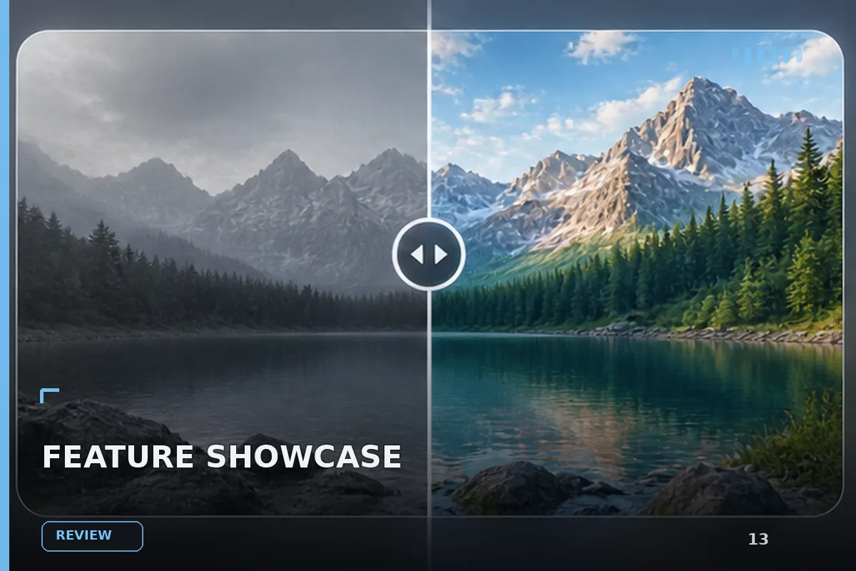
READY TO USE
直接开始使用
这条提示词无需补充变量,可查看并复制完整提示词。
复制后粘贴到任意 AI 平台即可直接使用
更新于 2026.10.14 · 持续复测
面向现代品牌的功能展示效果,以悬停反馈、沉浸式视频、动态渐变组织视觉层次;适合用于网页原型、品牌展示与交互动效参考。

「紫发金瞳波普风动漫少女」的 AI 图像提示词,适用于 GPT Image。通过效果图查看构图、光线与色彩方向,

「墨绿短发日常系动漫少女」的 AI 图像提示词,适用于 GPT Image。通过效果图查看构图、光线与色彩方向,

「珊瑚粉双马尾学园走廊少女」的 AI 图像提示词,适用于 GPT Image。通过效果图查看构图、光线与色彩方向

「蜜金发琥珀瞳学园少女动漫」的 AI 图像提示词,适用于 GPT Image。通过效果图查看构图、光线与色彩方向

「樱色双丸子头可爱少女动漫」的 AI 图像提示词,适用于 GPT Image。通过效果图查看构图、光线与色彩方向

「橙发麻花辫元气少女动漫」的 AI 图像提示词,适用于 GPT Image。通过效果图查看构图、光线与色彩方向,
查看完整提示词,复制后粘贴到任意 AI 平台使用。
Build a single React + TypeScript + Tailwind CSS v3 component called `FreedomSection`. It uses `hls.js` for HLS video streaming and `useEffect` / `useRef` from React. No external icon libraries — all icons are inline SVG or `<img>` tags. Fully mobile-responsive. No hover states.

---

## Global font

Register **"Mazzard H"** in `index.css` and apply it globally:

```css
@font-face {
  font-family: 'Mazzard H';
  font-weight: 400;
  font-style: normal;
  src: url('https://db.onlinewebfonts.com/t/eb5b5ee332420add9a40ee988cb6ac37.woff2') format('woff2'),
       url('https://db.onlinewebfonts.com/t/eb5b5ee332420add9a40ee988cb6ac37.woff') format('woff'),
       url('https://db.onlinewebfonts.com/t/eb5b5ee332420add9a40ee988cb6ac37.ttf') format('truetype');
}
@font-face {
  font-family: 'Mazzard H';
  font-weight: 500;
  font-style: normal;
  src: url('https://db.onlinewebfonts.com/t/875fffdfa62169a0f131e90f37f1faf4.woff2') format('woff2'),
       url('https://db.onlinewebfonts.com/t/875fffdfa62169a0f131e90f37f1faf4.woff') format('woff'),
       url('https://db.onlinewebfonts.com/t/875fffdfa62169a0f131e90f37f1faf4.ttf') format('truetype');
}

@tailwind base;
@tailwind components;
@tailwind utilities;

@layer base {
  html, body, * { font-family: 'Mazzard H', sans-serif; }
}
```

---

## Dependencies

`hls.js` must be installed: `npm install hls.js`. It is imported as `import Hls from 'hls.js'`.

---

## File: `src/components/FreedomSection.tsx`

### Constants (top of file)

```ts
const HLS_SRC = 'https://stream.mux.com/bnYL6x5cAX6WiJv2pOKpITehZd3NVdXpj3ylJFpX5Lk.m3u8';

const CROSS_ICON = 'https://cdn.prod.website-files.com/6720dd1ab6df0da205830ab1/686cc0f520a992816d8b15dc_bullet-list-cross.svg';
const CHECK_ICON = 'https://cdn.prod.website-files.com/6720dd1ab6df0da205830ab1/686cc068490683bbb3377d04_bullet-list.svg';

const negatives = [
  'Reactive firefighting when foundational issues surface too late',
  'Bloated coordination overhead drains bandwidth from core teams',
  "Constant re-verification because source data can't be trusted",
  'Fragmented vendor relations produce mismatched deliverables',
  'Scattered specs and decisions buried across siloed systems',
];

const positives = [
  'Layered dependency maps eliminate costly surprises at every phase',
  'Streamlined team handoffs deliver production-ready outcomes fast',
  'Live validation loops keep requirements locked across all stages',
  'Unified vendor management through a single accountable contact',
  'Centralized context and clear records accelerate every decision',
];
```

---

### `HlsVideo` sub-component (defined above `FreedomSection`, not exported)

```ts
function HlsVideo() {
  const videoRef = useRef<HTMLVideoElement>(null);

  useEffect(() => {
    const video = videoRef.current;
    if (!video) return;

    if (Hls.isSupported()) {
      const hls = new Hls({
        startLevel: -1,
        capLevelToPlayerSize: false,
        maxMaxBufferLength: 60,
        enableWorker: true,
      });
      hls.loadSource(HLS_SRC);
      hls.attachMedia(video);
      hls.on(Hls.Events.MANIFEST_PARSED, () => {
        hls.currentLevel = hls.levels.length - 1;
        video.play().catch(() => {});
      });
      return () => hls.destroy();
    } else if (video.canPlayType('application/vnd.apple.mpegurl')) {
      video.src = HLS_SRC;
      video.play().catch(() => {});
    }
  }, []);

  return (
    <video
      ref={videoRef}
      autoPlay
      loop
      muted
      playsInline
      style={{
        width: '160%',
        height: '160%',
        objectFit: 'cover',
        position: 'absolute',
        top: '50%',
        left: '50%',
        transform: 'translate(-50%, -50%)',
      }}
    />
  );
}
```

The video is zoomed to `160% x 160%` and centered with `translate(-50%, -50%)` inside a circular clipping container, so it fills the circle with no letterboxing.

---

### `FreedomSection` component

**`<section>`** — Tailwind: `w-full flex flex-col items-center`

Inline:
```
background-color: #ffffff
padding: clamp(48px, 6vw, 80px) clamp(16px, 3vw, 40px)
gap: 36px
```

---

#### Block 1 — Header

Tailwind: `flex flex-col items-center gap-9 text-center`

**Badge pill:**

Tailwind: `flex items-center gap-2 text-lg font-medium rounded-full`

Inline: `background-color: rgb(249, 249, 249)`, `padding: 0.9vw 1.25vw`, `color: rgb(26, 11, 84)`

Contains this inline SVG (`width: 19px`, `height: 18px`, `flex-shrink: 0`, `viewBox="0 0 17 16"`, `fill="none"`, `xmlns="http://www.w3.org/2000/svg"`):

```xml
<g clipPath="url(#freedom-clip)">
  <path
    fillRule="evenodd"
    clipRule="evenodd"
    d="M8.50037 3.66955C7.53221 2.82462 6.41758 2.275 5.333 2.07887C4.11096 1.85888 2.84987 2.0826 1.96658 2.95885C1.10056 3.81944 0.866218 5.04172 1.06751 6.23193C1.24778 7.29835 1.7803 8.39907 2.60501 9.35959C2.41536 10.1071 2.46371 10.8946 2.7434 11.6137C3.02308 12.3327 3.52035 12.9481 4.16678 13.375C4.81321 13.802 5.57702 14.0195 6.35308 13.9976C7.12915 13.9758 7.87933 13.7157 8.50037 13.2531C9.12146 13.7161 9.87183 13.9765 10.6482 13.9985C11.4245 14.0205 12.1886 13.8029 12.8352 13.3758C13.4819 12.9487 13.9792 12.3331 14.2588 11.6137C14.5384 10.8943 14.5865 10.1065 14.3965 9.35884C15.2204 8.39832 15.753 7.29835 15.9325 6.23119C16.1338 5.04098 15.8994 3.81944 15.0334 2.9596C14.1501 2.0826 12.889 1.85888 11.667 2.07962C10.5824 2.275 9.46854 2.82537 8.50037 3.66955Z"
    fill="rgb(200, 111, 255)"
  />
</g>
<defs>
  <clipPath id="freedom-clip">
    <rect width="16" height="16" fill="white" transform="translate(0.5)" />
  </clipPath>
</defs>
```

After the SVG: plain text **"Control"**

**`<h2>`** — Tailwind: `font-medium`

Inline: `font-size: clamp(32px, 4vw, 56px)`, `color: rgb(26, 11, 84)`, `line-height: 1.15`, `margin: 0`

Structure:
```
Stop absorbing the chaos.<br />
<span gradient>Run with confidence.</span>
```

Gradient `<span>` inline styles:
```
background-image: linear-gradient(90deg, rgb(43,167,255), rgb(202,69,255) 50%, rgb(254,136,27))
-webkit-background-clip: text
background-clip: text
-webkit-text-fill-color: transparent
color: transparent
padding-bottom: 0.3vw
display: inline-block
```

---

#### Block 2 — Three-column grid

Tailwind: `w-full flex flex-col lg:grid`

Inline:
```
grid-template-columns: 26vw 1fr 26vw
column-gap: 36px
row-gap: 24px
align-items: start
padding: 0 clamp(0px, 2.92vw, 40px)
gap: 24px
```

On mobile (`flex flex-col`): stacks vertically. On `lg:` and above: renders as 3-column grid with `gridTemplateColumns: '26vw 1fr 26vw'`.

---

##### Left column — Negatives

Tailwind: `flex flex-col`

Inline: `gap: 12px`, `font-size: clamp(13px, 1.15vw, 17px)`, `color: rgb(131, 121, 158)`

Map over `negatives`. Each card `<div>` — Tailwind: `flex flex-col`

Inline:
```
gap: 12px
padding: clamp(12px, 0.97vw, 16px) clamp(14px, 1.25vw, 20px)
border-radius: 18px
background-color: rgb(255, 255, 255)
box-shadow: 0 3px 9.1px #3f4a7e0d, 0 1px 29px #3f4a7e1a
```

Contents:
1. `<img src={CROSS_ICON} alt="" aria-hidden style={{ width: 'clamp(16px, 1.25vw, 20px)', flexShrink: 0 }} />`
2. `<div>{text}</div>` — inherits parent `color: rgb(131, 121, 158)`

---

##### Center column — Video circle

Tailwind: `flex items-center justify-center order-first lg:order-none`

Inline: `align-self: center`

On mobile, `order-first` places the video above both card columns. On `lg:`, `lg:order-none` restores it to the middle.

Inside, a circular container:
```
position: relative
border-radius: 50%
overflow: hidden
width: clamp(200px, 22vw, 400px)
height: clamp(200px, 22vw, 400px)
flex-shrink: 0
```

Inside the circle: `<HlsVideo />` (described above — the `<video>` is absolutely positioned at 160% size, centered with translate -50% -50%).

---

##### Right column — Positives

Tailwind: `flex flex-col`

Inline: `gap: 12px`, `font-size: clamp(13px, 1.15vw, 17px)`

Map over `positives`. Each card `<div>` — Tailwind: `flex flex-col`

Inline: (same shadow/padding/border-radius as negatives)
```
gap: 12px
padding: clamp(12px, 0.97vw, 16px) clamp(14px, 1.25vw, 20px)
border-radius: 18px
background-color: rgb(255, 255, 255)
box-shadow: 0 3px 9.1px #3f4a7e0d, 0 1px 29px #3f4a7e1a
```

Contents:
1. `<img src={CHECK_ICON} alt="" aria-hidden style={{ width: 'clamp(16px, 1.25vw, 20px)', flexShrink: 0 }} />`
2. `<div style={{ color: 'rgb(26, 11, 84)' }}>{text}</div>`

---

## Layout summary

- **Mobile**: flex-col — video first (order-first), then left negatives, then right positives stacked vertically
- **Desktop (lg+)**: CSS grid — left negatives | center video circle | right positives
- Section background is pure white `#ffffff`
- No animations, no hover states, no scroll effects
提示词已复制,选择一个常用平台继续。
