

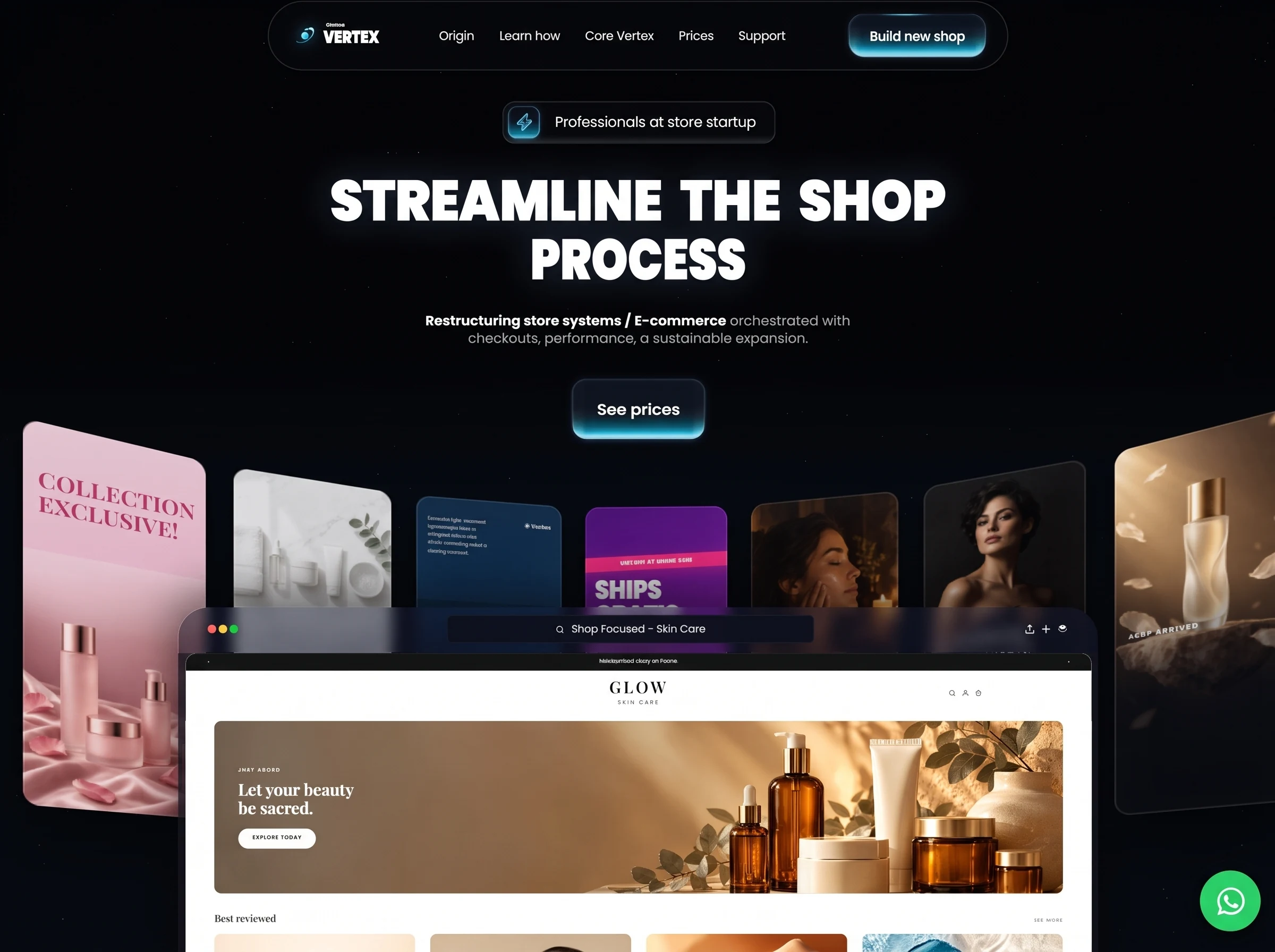
通过高密度商品视觉、现代排版与交互反馈建立数字商业入口,适合电商和品牌零售平台。
Vertex 数字商务首屏
效果案例
READY TO USE
直接开始使用
这条提示词无需补充变量,可查看并复制完整提示词。
复制后粘贴到任意 AI 平台即可直接使用
更新于 2026.10.14 · 持续复测
通过高密度商品视觉、现代排版与交互反馈建立数字商业入口,适合电商和品牌零售平台。

「紫发金瞳波普风动漫少女」的 AI 图像提示词,适用于 GPT Image。通过效果图查看构图、光线与色彩方向,

「墨绿短发日常系动漫少女」的 AI 图像提示词,适用于 GPT Image。通过效果图查看构图、光线与色彩方向,

「珊瑚粉双马尾学园走廊少女」的 AI 图像提示词,适用于 GPT Image。通过效果图查看构图、光线与色彩方向

「蜜金发琥珀瞳学园少女动漫」的 AI 图像提示词,适用于 GPT Image。通过效果图查看构图、光线与色彩方向

「樱色双丸子头可爱少女动漫」的 AI 图像提示词,适用于 GPT Image。通过效果图查看构图、光线与色彩方向

「橙发麻花辫元气少女动漫」的 AI 图像提示词,适用于 GPT Image。通过效果图查看构图、光线与色彩方向,
查看完整提示词,复制后粘贴到任意 AI 平台使用。
Build a single, self-contained, production-ready `index.html` — one file, no build
step, no frameworks, no local assets. It renders a full-viewport dark hero section
for a fictional e-commerce SaaS called "Vertex Shops". Every image loads from the
absolute CloudFront URLs in §8. There is NO video anywhere in this page.
Two components below are marked PIXEL CONTRACT. Those are the most commonly
botched parts of this design. Implement them exactly as written, including the
DO-NOT lists. Do not "improve" them, do not substitute a more conventional
button/pill pattern, do not add glows or centring that is not specified.
=====================================================================
0. GLOBAL SHELL
=====================================================================
<!doctype html>, <html lang="en-US">.
<title>Vision — Streamline the shop virtual</title>
<meta name="viewport" content="width=device-width, initial-scale=1, viewport-fit=cover">
FONTS — exactly these three tags in <head>, in this order:
<link rel="preconnect" href="https://fonts.googleapis.com">
<link rel="preconnect" href="https://fonts.gstatic.com" crossorigin>
<link href="https://fonts.googleapis.com/css2?family=Poppins:wght@400;500;600;700;800;900&family=Playfair+Display:ital,wght@0,600;1,600&display=swap" rel="stylesheet">
Reset: *{margin:0;padding:0;box-sizing:border-box}
html,body{height:100%;overflow:hidden;background:#020204} /* page never scrolls */
body{font-family:Poppins,Inter,system-ui,sans-serif;color:#fff;-webkit-font-smoothing:antialiased}
a{text-decoration:none;color:inherit} /* REQUIRED - button labels must never underline */
=====================================================================
1. CORE ARCHITECTURE — A FIXED DESIGN CANVAS THAT IS SCALED
=====================================================================
The single most important idea: the desktop composition is authored at a fixed
1172 x 657 px design canvas. EVERY element is absolutely positioned in raw design
pixels — there is no flow layout, no flexbox column, no auto-centring on desktop.
The whole canvas is then scaled by ONE transform to fit the viewport. The optical
centre of every centred element is x=586.
.stage{position:fixed;inset:0;overflow:hidden;background:#020204}
.canvas{position:absolute;left:50%;top:0;width:1172px;height:657px;
transform:translateX(-50%) scale(var(--k,1));transform-origin:50% 0}
.canvas>*{position:absolute}
.stack{position:absolute;inset:0;z-index:300} /* layout shell, no box of its own */
.stack>*{position:absolute}
.navmenu{display:contents} /* shell, invisible on desktop */
.burger{display:none} /* desktop */
Scale law, computed in JS on every resize:
k = min(vw / W, vh / 560)
Using 560 (not 657) as the height divisor is deliberate: it fills the width and
lets the browser mock bleed off the bottom edge rather than letterboxing.
W = 1172 on desktop; see §10 for the tablet ramp.
Background (never animates — it is the stage):
.bg{position:absolute;inset:0;
background:
linear-gradient(180deg, rgba(25,127,255,0) 38%, rgba(25,127,255,.042) 54%,
rgba(25,127,255,.052) 68%, rgba(25,127,255,.030) 100%),
#020204}
STARFIELD — two 1x1px divs whose entire star field is one giant box-shadow list,
generated in JS. .stars{position:absolute;left:0;top:0;width:1px;height:1px;
border-radius:50%;background:#fff}
Layer A (#stA): 150 stars, blur 0px, alpha random .05–.30
Layer B (#stB): 18 stars, blur 1.2px, alpha random .35–.70
Each entry: "<rand 0-100>vw <rand 0-100>vh <blur>px 0 rgba(255,255,255,<alpha>)",
joined with commas, assigned to el.style.boxShadow.
=====================================================================
1.5 EXACT COORDINATE TABLE — NON-NEGOTIABLE
=====================================================================
All values are design pixels inside the 1172 x 657 canvas. Reproduce every one.
If your layout does not match this table, the layout is wrong.
ELEMENT POSITION SIZE RADIUS
.nav left 247, top 3 678 x 64 32
.mark left 21, top 19 (in nav) 24 x 24 —
.wm left 50, top 0 (in nav) auto —
.wm .kick left 3, top 20 auto —
.wm .name left 0, top 26 auto —
.links left 156, top 0 (in nav) auto x 62 —
.nav .btn left 530.7,top 10.5 125.5 x 39.5 14
.badge left 462, top 95 250 x 39 12
.badge i left 4, top 4 (in badge) 29 x 29 8
.badge b left 45, top 0 (in badge) auto x 39 —
.h1 (both lines) left 586, translateX(-50%) nowrap —
#h1a first baseline y 204.5 ink width 563.5 cap height 37.2
#h1b first baseline y 258.5 ink width 197.5 cap height 37.2
.sub (both lines) left 586, translateX(-50%) nowrap —
#sub1 first baseline y 300.5 ink width 389 cap height 8.4
#sub2 first baseline y 316.5 ink width 311 cap height 8.4
.cta2 left 526, top 349 121 x 54.5 13
.showcase left 0, top 0 1172 x 0 —
.ring left 0, top 0 1172 x 657 —
.card left 586, top 616 130 x 300 12
margin:-150px 0 0 -65px (so the card centres on that point)
.browser left 165, top 558 842 x calc(99px + var(--fill,0px))
radius 28 28 0 0
.page left 7, right 6, top 42, bottom 0 10 10 0 0
.wa right 16, bottom 24 (in .stage, OUTSIDE .canvas) 56 x 56 50%
Z-INDEX ORDER (front to back): .nav 400 · .stack / .h1 / .sub / .cta2 / .badge /
.wa 300 · .browser 100 · .ring 5 · .bg 0.
The browser mock MUST paint in FRONT of the carousel ring, overlapping its lower
third. That overlap is the whole point of the composition.
Remaining ink targets for the type fitter (§11):
#wmName ink 51 cap 11.4 first baseline y 38.5
#badgeTxt ink 184 cap 9.4 transform pre 'translate(2px,-1px)'
#ctaLabel ink 87 cap 8.9 then optically centred in its button
#vpLabel ink 76 cap 9.5 then optically centred in its button
.links a cap 7.9 (one shared size), then the whole row squeezed to width 317
=====================================================================
2. PIXEL CONTRACT A — THE BADGE
=====================================================================
The badge is a FIXED-SIZE absolutely-positioned box with an icon tile pinned to
its left edge and a left-aligned label beside it. It is NOT a centred pill and
NOT a flex row.
.badge{left:462px;top:95px;width:250px;height:39px;border-radius:12px;z-index:300;
border:1px solid rgba(255,255,255,.115);
/* faint bank of light along the foot, sampled off the prototype */
background:linear-gradient(to top,
rgba(190,225,255,.175) 0px, rgba(190,225,255,.128) 2px, rgba(190,225,255,.075) 4px,
rgba(190,225,255,.026) 6px, rgba(255,255,255,.012) 9px, rgba(255,255,255,.012) 100%);
-webkit-backdrop-filter:blur(12px);backdrop-filter:blur(12px);
box-shadow:inset 0 1px 0 rgba(255,255,255,.035)}
.badge i{position:absolute;left:4px;top:4px;width:29px;height:29px;border-radius:8px;
display:grid;place-items:center;
background:linear-gradient(to top,
#46afc8 0px, #35abc7 2px, #0b859d 4px, #026c84 6px, #004e66 8px,
#053f58 10px, #012c3d 12px, #031a2a 14px, #061125 16px, #090f25 19px,
#090c1c 23px, #060d16 29px);
box-shadow:inset 1px 0 0 rgba(150,220,250,.40),
inset -1px 0 0 rgba(150,220,250,.52),
0 0 6px rgba(60,190,230,.20), 0 3px 8px -5px rgba(90,220,255,.6)}
.badge i svg{width:14px;height:16px;position:relative;top:-1px;left:0px}
.badge b{position:absolute;left:45px;transform-origin:0 50%;top:0;height:39px;
display:flex;align-items:center;
font-size:13px;font-weight:400;color:rgba(255,255,255,.94);white-space:nowrap;
padding-top:1.5px}
Markup: <div class="badge"><i>…bolt svg…</i><b id="badgeTxt">Professionals at store startup</b></div>
Bolt SVG: viewBox "5 1 14 22", preserveAspectRatio="none",
fill rgba(16,112,152,.72), stroke rgba(190,236,255,.6), stroke-width 1.6,
stroke-linejoin round, single path:
"M13.9 1.6 5.5 13.6a.7.7 0 0 0 .6 1.1h4.2l-1 7.7a.7.7 0 0 0 1.25.55l8.3-12.1a.7.7 0 0 0-.6-1.1h-4.2l1-7.7a.7.7 0 0 0-1.25-.55Z"
How it must LOOK: a dark, almost transparent 250x39 rounded rectangle with a 1px
hairline border. At its far left, inset 4px, a small bright cyan-to-navy rounded
square holding a white-stroked lightning bolt. The label begins 45px from the
badge's left edge — a clear 12px gap after the tile — reads left-to-right, and is
vertically centred in the 39px height. Tile and text NEVER overlap.
DO NOT:
- do not centre the label in the badge, and do not use justify-content:center,
text-align:center, or margin:auto on .badge b
- do not make .badge display:flex with a gap and let the icon and text flow
- do not let the badge width grow to fit the text (it is exactly 250px; the text
is scaled to a 184px ink width by the fitter)
- do not put the icon on top of, or behind, the text
- do not add an outer glow, drop-shadow, or coloured ring to .badge itself
- do not increase the border-radius into a full pill (it is 12px, not 20px)
=====================================================================
3. PIXEL CONTRACT B — THE GLOW BUTTON (.btn), USED TWICE
=====================================================================
The signature element: a near-black button with a bank of cyan light pooled at
its FOOT. That light is a BACKGROUND GRADIENT CLIPPED BY THE BUTTON'S OWN ROUNDED
RECT. It is not a glow, not a shadow, not a separate bar, not a neon underline.
`overflow:hidden` is mandatory and does the clipping.
.btn{display:grid;place-items:center;color:#fff;position:relative;overflow:hidden;
/* bloom is a fixed ~18px bank of light at the foot, sampled row by row */
background:linear-gradient(to top,
#9ad9ec 1px, #89dff0 2px, #79e0f1 3px, #61daef 4px, #3ec8e4 5px,
#14a8c6 6px, #0596b3 7px, #038aa8 8px, #047796 9px, #006180 10px,
#025066 12px, #0a4f5e 13px, #04465a 14px, #073746 16px,
#0a2a37 18px, #0d212e 20px, #0f1824 24px, #0a121e 30px,
#0a111d 34px, #0a111d 100%);
box-shadow:
inset 0 3px 3px -2px rgba(180,228,255,.10),
inset 1px 0 0 rgba(255,255,255,.09),
inset -1px 0 0 rgba(255,255,255,.09),
var(--hair,0 1px 0 rgba(152,218,234,.38)),
1px 0 0 rgba(152,218,234,.17), -1px 0 0 rgba(152,218,234,.17),
0 0 8px rgba(60,190,235,.10),
0 2px 5px -3px rgba(90,220,255,.45);
transition:transform .25s,box-shadow .25s,filter .25s}
.btn::before — a thin bright streak across the TOP edge only:
content:"";position:absolute;left:22%;right:38%;top:0.8px;height:1.9px;z-index:1;
filter:blur(.55px);
background:linear-gradient(90deg,rgba(120,225,255,0) 0%,rgba(120,225,255,.58) 34%,
rgba(160,240,255,.74) 50%,rgba(120,225,255,.58) 66%,rgba(120,225,255,0) 100%)
.btn::after — side edge-light, 13px inward falloff, MASKED so it attenuates up the
button (boost over the fill: +50 @12px from the foot, +35 @18, +25 @24, +17 @30).
The mask is mandatory; without it the edge light floods the entire button.
content:"";position:absolute;inset:0;border-radius:inherit;pointer-events:none;z-index:1;
background:linear-gradient(90deg,rgba(200,245,255,.70),rgba(200,245,255,0) 13px),
linear-gradient(270deg,rgba(200,245,255,.70),rgba(200,245,255,0) 13px);
-webkit-mask:linear-gradient(to top,#000 0,#000 6px,rgba(0,0,0,.40) 12px,
rgba(0,0,0,.15) 18px,rgba(0,0,0,.09) 24px,rgba(0,0,0,.02) 30px,rgba(0,0,0,.02) 100%);
mask:linear-gradient(to top,#000 0,#000 6px,rgba(0,0,0,.40) 12px,
rgba(0,0,0,.15) 18px,rgba(0,0,0,.09) 24px,rgba(0,0,0,.02) 30px,rgba(0,0,0,.02) 100%)
.btn span{position:relative;z-index:2;display:block;line-height:1;
text-shadow:0 1px 2px rgba(0,20,30,.5)}
.btn:hover{transform:translateY(-1px);filter:brightness(1.12);
box-shadow:inset 0 1px 0 rgba(200,245,255,.6),inset 1px 0 0 rgba(170,225,255,.35),
inset -1px 0 0 rgba(170,225,255,.35),0 6px 22px rgba(20,180,225,.55)}
Instance A — nav CTA, <a class="btn"><span id="ctaLabel">Build new shop</span></a>:
.nav .btn{position:absolute;left:530.7px;top:10.5px;width:125.5px;height:39.5px;
border-radius:14px;font-size:14px;font-weight:500;letter-spacing:-.005em}
.nav .btn span{margin-top:0}
Instance B — hero CTA, <a class="btn cta2"><span id="vpLabel">See prices</span></a>:
.cta2{position:absolute;left:526px;top:349px;width:121px;height:54.5px;
--hair:0 0 0 transparent;border-radius:13px;font-size:17px;font-weight:500;
letter-spacing:-.01em;z-index:300}
.cta2::before{display:none} /* the HERO button has no top streak; the nav one does */
.cta2 span{margin-top:0}
How it must LOOK: the top ~60% of the button is near-black (#0a111d). The bottom
~18px is a saturated teal-to-pale-cyan band, brightest in its last 1-5px, fading
upward and dying out completely by 34px. The band spans the full inner width and
its bottom corners follow the button's border-radius exactly — it is visibly cut
off by the button's own edge, with nothing bleeding past it. The nav button also
carries a faint 2px light streak across its top edge. The label is centred,
white, Poppins 500, never underlined.
DO NOT:
- do not add ANY outer glow or halo: no extra box-shadow with a blur above 8px,
no filter:drop-shadow, no blurred pseudo-element sitting outside the button,
no ::before/::after positioned beyond inset:0. The box-shadow list above is
complete and final — its largest outer blur is 8px at 10% alpha.
- do not omit overflow:hidden; without it the light bank escapes the rounded rect
- do not omit the ::after mask
- do not replace the multi-stop foot gradient with a simple two-colour gradient,
a solid bar, a ::after bar, or a border-bottom
- do not let the light bank read as a separate element beneath the button
- do not give .cta2 a ::before streak, and do not remove it from the nav button
- do not use a <button> for these; both are <a href="#"> with an inner <span>
=====================================================================
4. NAV PILL
=====================================================================
.nav{left:247px;top:3px;width:678px;height:64px;border-radius:32px;z-index:400;
background:rgba(255,255,255,.008);
border:1px solid rgba(255,255,255,.105);
-webkit-backdrop-filter:blur(16px) saturate(140%);
backdrop-filter:blur(16px) saturate(140%);
box-shadow:inset 0 1px 0 rgba(255,255,255,.03)}
LOGO MARK — inline SVG, 24x24 at left:21px top:19px, viewBox "0 0 48 48",
filter:drop-shadow(0 0 6px rgba(60,224,255,.75)). Two linearGradients in <defs>:
#sw x1=8 y1=8 x2=40 y2=40 userSpaceOnUse: #8ef4ff -> #35d8ff @.5 -> #0a86d8
#sw2 x1=40 y1=10 x2=10 y2=40: #a6f7ff -> #0f9ae0 @opacity .25
Content: <g transform="rotate(-32 24 24)"> holding
<ellipse cx=24 cy=24 rx=18.5 ry=9.6 stroke="url(#sw2)" stroke-width=3.1
stroke-linecap=round stroke-dasharray="58 30" stroke-dashoffset=14>
and <circle cx=41.4 cy=20.6 r=3.1 fill=#bff6ff> </g>
then <circle cx=24 cy=24 r=6.6 fill="url(#sw)"> and <circle cx=24 cy=24 r=2.6 fill=#fff>.
(An orbit ring with a satellite dot and a glowing core.)
WORDMARK .wm{position:absolute;left:50px;top:0;white-space:nowrap}
.wm .kick{position:absolute;left:3px;top:20px;font-size:4.4px;font-weight:600;
letter-spacing:.10em;color:#fff;opacity:.92;line-height:1} -> "SHOPS"
.wm .name{position:absolute;left:0;top:26px;transform-origin:0 50%;
font-family:Poppins;font-weight:900;font-size:22px;line-height:1;
letter-spacing:-.01em;color:#fff} id="wmName" -> "VERTEX"
("SHOPS" is a small kicker sitting directly ABOVE the heavy "VERTEX" wordmark.)
LINKS .links{position:absolute;left:156px;top:0;height:62px;transform-origin:0 50%;
display:flex;align-items:center;gap:24px}
.links a{font-size:12.5px;font-weight:400;color:rgba(255,255,255,.92);
white-space:nowrap;transition:opacity .25s} .links a:hover{opacity:.65}
Five links, in order: Origin / Learn how / Core Vertex / Prices / Support
=====================================================================
5. HERO TYPE
=====================================================================
.h1{left:586px;transform:translateX(-50%);white-space:nowrap;line-height:1;
font-family:Poppins;font-weight:900;font-size:54px;letter-spacing:-.004em;
word-spacing:.175em;text-transform:uppercase;color:#fff;
text-shadow:0 0 34px rgba(130,180,255,.22);z-index:300}
Two lines: id="h1a" "Streamline the shop" / id="h1b" "Process"
.sub{left:586px;transform:translateX(-50%);white-space:nowrap;line-height:1;
font-size:13.2px;color:#a9aeb5;z-index:300}
.sub b{font-weight:600;color:#fff} .nb{white-space:nowrap}
id="sub1": <b>Restructuring store systems / <span class="nb">E-commerce</span></b> orchestrated with
id="sub2": checkouts, performance, a sustainable expansion.
=====================================================================
6. THE CAROUSEL — A TRUE 3D PERSPECTIVE RING (the centrepiece)
=====================================================================
Not a flat slider. 37 cards are placed on a cylinder whose camera sits AT the ring
centre, so the cards are tangent to the cylinder and each faces the camera exactly.
Vertical card sides with a slanted top edge is PERSPECTIVE, not rotation.
Constants: radius R = 891, perspective = 891, n = 37 cards,
angular step = 360/37 = 9.7297°, cull angle = 42°, speed = 1.9 deg/s,
card 130 x 300, card plane y=616, horizon y=918.
.showcase{position:absolute;left:0;top:0;width:1172px;height:0}
.ring{position:absolute;left:0;top:0;width:1172px;height:657px;z-index:5;
perspective:891px;perspective-origin:586px 918px;transform-style:preserve-3d;
pointer-events:none}
.card{position:absolute;left:586px;top:616px;width:130px;height:300px;
margin:-150px 0 0 -65px;border-radius:12px;overflow:hidden;background:#0d1117;
box-shadow:0 24px 46px rgba(0,0,0,.6),0 3px 8px rgba(0,0,0,.5);
backface-visibility:hidden;will-change:transform}
.card img{position:absolute;inset:0;width:100%;height:100%;object-fit:cover}
.card .edge{position:absolute;inset:0;border-radius:12px;
box-shadow:inset 0 0 0 1px rgba(255,255,255,.15),
inset 0 16px 30px rgba(255,255,255,.05)}
.card.broken img{display:none}
Placement, per card index i, with a running `phase` (starts at -2):
a = ((i*step + phase) % 360 + 540) % 360 - 180 // signed angle, -180..180
if (|a| > 42) -> el.style.visibility='hidden'; skip // cull the back half
else visibility='visible'
r = a * PI/180; c = cos(r)
transform = translate3d(R*sin(r) px, 0, R*(1-c) px) rotateY(-a deg)
filter = brightness(0.84 + 0.5*(1/c - 1)) // edges dim, front bright
Animation loop via requestAnimationFrame: dt = min((t-last)/1000, .1);
phase -= 1.9 * dt (continuous, never resets). Freeze phase when
matchMedia('(prefers-reduced-motion: reduce)') matches — still render, just no spin.
On 'visibilitychange' reset the `last` timestamp so a backgrounded tab does not jump.
Shared creative sub-classes:
.cv{position:absolute;left:0;right:0;padding:0 10px}
.fill{position:absolute;inset:0}
.ph{position:absolute;left:0;right:0;overflow:hidden;
background:linear-gradient(155deg,#2b3b50,#131c28 60%,#1d1526)} /* fallback */
.phf{top:0;bottom:0}
.ph img{position:absolute;inset:0;width:100%;height:100%;object-fit:cover}
.dot{display:inline-block;width:4.5px;height:4.5px;background:#e5202f;
margin-right:4px;transform:rotate(45deg) translateY(-1px)}
.dot.sq{transform:none;width:6.5px;height:4.5px;border-radius:1px}
.t-big{font-family:Poppins;font-weight:900;text-transform:uppercase;line-height:.96;
letter-spacing:-.015em;white-space:nowrap;transform:scaleX(.875);
transform-origin:left center}
.t-serif{font-family:"Playfair Display",serif;line-height:1.02;letter-spacing:.01em;
white-space:nowrap}
=====================================================================
7. THE TEN CARD CREATIVES
=====================================================================
Build a SHOTS array of 10 objects {url, v, t?} and a creative(d) function that
switches on d.v and returns an HTML string. Each card = creative(d) + '<div class="edge"></div>'.
Let im = '<img alt="" src="' + d.url + '">'. Cards cycle: SHOTS[i % 10].
Attach an 'error' listener to each img that adds .broken to the card.
All card typography is HTML/CSS overlay — the photographs themselves carry no text.
v='pay' (checkout):
fill background:#efedea
.ph top:112px;bottom:0 -> im
<svg class="ph" style="top:118px;bottom:0" viewBox="0 0 130 182" preserveAspectRatio="none">
<g stroke="#e5202f" stroke-width="8" fill="none" opacity=".92" stroke-linecap="square">
<path d="M2 42h30M14 30v96M4 100l26-16"/>
<path d="M96 34v58M120 34v58M96 92q12 15 24 0"/>
<path d="M92 108l14 34M126 108l-12 34"/></g></svg>
.cv top:20px;text-align:right;font-size:3.4px;letter-spacing:.15em;color:#8d9298
-> METHOD OF CHECKOUTS
.cv.t-big top:32px;font-size:14px;color:#16171b -> Checkouts
.cv.t-big top:47px;font-size:14px;color:#e5202f -> Quick n simple
.cv top:76px;font-size:5.2px;font-weight:700;color:#16171b;line-height:1.7 ->
<div><b class="dot"></b>SPEND VIA <b>ACH</b></div>
<div style="margin-top:8px"><b class="dot sq"></b>OR AT MAX <b>12X</b><br>
<span style="margin-left:11px">ON CREDIT</span></div>
v='launch':
fill background:linear-gradient(168deg,#f9d9e5,#f3bdd2 55%,#e8a3c0)
.ph top:100px;bottom:0 -> im + inner fill
linear-gradient(180deg,rgba(249,217,229,.97),rgba(249,217,229,0) 30%)
.cv.t-serif top:36px;font-size:17px;color:#b03a63 -> COLLECTION
.cv.t-serif top:55px;font-size:17px;color:#b03a63 -> EXCLUSIVE!
v='shop' (regimen):
fill background:#fff
.ph top:0;height:148px -> im
.cv top:158px;font-size:5.4px;font-weight:700;letter-spacing:.09em;color:#16171b
-> REGIME AT DAWNS
.cv top:168px;font-size:4.2px;color:#7b8087 -> Cleanse · Serum · Moisturize
div left:10px;top:180px;padding:4px 11px;border-radius:20px;background:#16171b;
font-size:4.6px;font-weight:600;color:#fff;letter-spacing:.05em -> Acquire today
v='brand' (formula):
fill background:linear-gradient(180deg,#0a2a4a,#0d3a63 50%,#08192b)
.ph top:92px;bottom:0 -> im + inner fill
linear-gradient(180deg,rgba(10,42,74,.98),rgba(10,42,74,0) 36%)
.cv top:16px;font-size:4.2px;line-height:1.7;color:rgba(255,255,255,.82);width:74px
-> Formulas light, assessed hypoallergenically n designed with a new ritual — revealing since a starting moment.
div right:10px;top:16px;font-size:5.4px;font-weight:600;color:#fff;opacity:.92 -> ✳ Vertex
v='frete' (shipping):
fill background:linear-gradient(158deg,#4a0c80 0%,#7a16a6 40%,#a81fc6 66%,#5c0e90 100%)
.ph top:140px;bottom:0;opacity:.45;mix-blend-mode:screen -> im
fill background:radial-gradient(44% 16% at 50% 62%, rgba(255,255,255,.92), rgba(255,255,255,0) 72%)
div left:-6px;right:-6px;top:44px;height:13px;background:#ff2d8a;
transform:rotate(-2.6deg);box-shadow:0 4px 12px rgba(255,45,138,.5)
div left:0;right:0;top:45.5px;transform:rotate(-2.6deg);text-align:center;
font-size:5.6px;font-weight:700;letter-spacing:.05em;color:#fff -> OBTAIN AT HOME AND
.cv.t-big top:64px;font-size:24px;color:#fff;text-shadow:0 3px 0 rgba(84,9,124,.6) -> Ships
.cv.t-big top:87px;font-size:24px;color:#fff;text-shadow:0 3px 0 rgba(84,9,124,.6) -> Gratis
.cv.t-big top:113px;font-size:19px;color:#fff -> +
v='power' (feminine):
.ph.phf -> im
fill background:linear-gradient(180deg,rgba(6,5,10,0) 34%,rgba(6,5,10,.55) 52%,rgba(6,5,10,.92) 72%)
.cv.t-serif top:132px;font-size:16px;color:#fff -> A POWER
.cv.t-serif top:150px;font-size:16px;color:#fff -> FEMININE
.cv top:171px;font-size:4.4px;letter-spacing:.07em;color:rgba(255,255,255,.85)
-> is echoing in all we acquire
v='off' (sale):
.ph.phf -> im
fill background:linear-gradient(180deg,rgba(3,9,20,0) 30%,rgba(3,9,20,.6) 48%,rgba(3,9,20,.95) 70%)
.cv.t-big top:126px;font-size:10px;color:#fff;opacity:.9 -> On sale · til
.cv.t-big top:139px;font-size:22px;color:#3fe3ff;text-shadow:0 0 16px rgba(63,227,255,.5)
-> 50% off
v='plain' (default, used 3x with a `t` caption):
.ph.phf -> im
fill background:linear-gradient(180deg,rgba(4,8,16,0) 38%,rgba(4,8,16,.85) 68%)
.cv top:150px;font-size:5.4px;font-weight:600;letter-spacing:.2em;color:#fff -> d.t
=====================================================================
8. IMAGE URLS — USE THESE EXACT ABSOLUTE URLS, VERBATIM
=====================================================================
All 15 are PNGs on CloudFront. No local files, no relative paths, no <video>.
Base (expand it in full at every use site; do not abbreviate):
https://d8j0ntlcm91z4.cloudfront.net/user_38xzZboKViGWJOttwIXH07lWA1P/
SHOTS array, in this exact order (source aspect ratio in brackets):
1 v:'pay' [2:3]
.../hf_20260912_110422_0fc34393-7417-41b0-a200-43fd2b08a37f.png
2 v:'launch' [2:3]
.../hf_20260912_110423_ba46182e-43bc-43a8-9007-a8234acf442d.png
3 v:'shop' [2:3]
.../hf_20260912_110423_06cfbb84-6f96-48f6-be45-e03516510e48.png
4 v:'brand' [2:3]
.../hf_20260912_110422_634bf390-f171-4f5d-9151-0d2c86c26e7b.png
5 v:'frete' [2:3]
.../hf_20260912_110423_0cfe058d-db0e-4ee6-9708-7a297cc11a7a.png
6 v:'plain', t:'RITUAL REGIME' [9:16]
.../hf_20260912_110422_a90a35d7-ae20-4ce3-86d7-e3f6f658a6bc.png
7 v:'power' [9:16]
.../hf_20260912_110422_de267714-7647-4d9a-a0a9-55325683b2a2.png
8 v:'plain', t:'JUST ARRIVED' [9:16]
.../hf_20260912_110504_80eda275-e380-4ccb-b51f-332f25337079.png
9 v:'off' [9:16]
.../hf_20260912_110422_d6ba08f5-4ff8-4f09-8abe-93ee6bb0e34e.png
10 v:'plain', t:'STREETWEAR' [9:16]
.../hf_20260912_110423_87ec2115-3157-47ef-ac98-973f8ad6532d.png
Browser-mock store page (§9):
hero banner, 21:9, alt="Warm amber and ivory skincare collection in golden morning light"
.../hf_20260912_110504_0316394c-37bd-432b-a1f2-ee46a461c22b.png
product 1, 1:1, alt="Vitamin C serum in amber glass"
.../hf_20260912_110423_3b5dcf24-cc07-4f3b-8423-b597fffcdbfb.png
product 2, 1:1, alt="Nourishing lotion jar on soft linen"
.../hf_20260912_110504_50ec81be-8341-447f-a0c2-a5673a465447.png
product 3, 1:1, alt="Three-piece Sunset Renewal skincare kit"
.../hf_20260912_110504_fd208d72-9112-4cde-b509-8d273b470c6f.png
product 4, 1:1, alt="Lightweight facial sunscreen beside clear water"
.../hf_20260912_110504_9731544c-a83b-48c4-bacb-e31e4d4b9f42.png
=====================================================================
9. THE BROWSER MOCK (in FRONT of the ring, bleeding off the bottom)
=====================================================================
.browser{position:absolute;left:165px;top:558px;width:842px;
height:calc(99px + var(--fill,0px)); /* --fill is set by JS, see §10 */
border-radius:28px 28px 0 0;overflow:hidden;z-index:100;
box-shadow:0 -14px 44px rgba(0,0,0,.55)}
.browser::before{content:"";position:absolute;left:0;right:0;top:42px;bottom:0;
background:rgba(20,20,26,.82);z-index:0}
CHROME BAR
.bar{position:absolute;left:0;top:0;width:100%;height:42px;
background:linear-gradient(180deg,rgba(20,24,48,.48),rgba(15,19,38,.58));
-webkit-backdrop-filter:blur(6px) saturate(112%);backdrop-filter:blur(6px) saturate(112%)}
.dots{position:absolute;left:27px;top:16px;display:flex;gap:2.6px}
.dots i{width:7.6px;height:7.6px;border-radius:50%}
three dots: #ee5c62, #f6b719, #12c02f
.omni{position:absolute;left:246px;top:7px;width:336px;height:26px;border-radius:5px;
background:rgba(9,13,26,.93);box-shadow:inset 0 0 0 1px rgba(255,255,255,.045);
display:flex;align-items:center;justify-content:center;gap:6px}
.omni svg{width:9px;height:9px;opacity:.72} magnifier: circle cx11 cy11 r7 +
path "M20 20l-3.8-3.8", stroke #fff, stroke-width 2.4
.omni span{font-size:9.5px;color:rgba(255,255,255,.72);letter-spacing:.005em}
-> "Shop Focused - Skin Care"
.tools{position:absolute;right:27px;top:14px;display:flex;align-items:center;gap:4px;
opacity:.9} .tools svg{width:11px;height:12px}
Three 24x24 icons, stroke #fff: (a) upload/share — "M12 16V4m0 0L8 8m4-4 4 4" +
"M4 15v5h16v-5"; (b) plus — "M12 5v14M5 12h14" stroke-width 2.2; (c) stacked
layers — filled "M12 3 3 8l9 5 9-5-9-5Z" opacity .95 + stroked "M3 13l9 5 9-5" opacity .55
PAGE SURFACE
.page{position:absolute;left:7px;right:6px;top:42px;bottom:0;background:#fff;
color:#111;overflow:hidden;border-radius:10px 10px 0 0}
.ann{position:absolute;left:0;top:0;width:100%;height:16px;background:#101210;
display:grid;place-items:center;border-radius:10px 10px 0 0}
.ann span{font-size:5px;letter-spacing:.06em;color:#cfcfcf} -> "Moisturized daily at home"
.ann u{position:absolute;font-size:6px;color:#9a9a9a;text-decoration:none}
two arrows: ‹ at left:20px, › at right:20px
.shoplogo{position:absolute;left:50%;transform:translateX(-50%);top:24px;text-align:center}
em -> "GLOW": Playfair Display, font-style normal, 600, 15px, ls .14em, lh 1, block
i -> "SKIN CARE": font-style normal, 5px, ls .3em, color #3a3a3a, margin-top 3px, block
.shopicons{position:absolute;right:100px;top:33px;display:flex;gap:5px;opacity:.85}
.shopicons svg{width:7px;height:7px} stroke #222 stroke-width 2: search (circle
cx11 cy11 r7 + "M20 20l-3.8-3.8"), account (circle cx12 cy8 r4 +
"M4.5 21c0-4.2 3.4-6.6 7.5-6.6s7.5 2.4 7.5 6.6"), bag ("M5.5 8h13l-1.2 12H6.7L5.5 8Z"
+ "M9 8V6.2A3 3 0 0 1 15 6.2V8")
STORE FRONT — only design px 57–344 are ever on screen, so order matters:
hero banner first, best-sellers below.
.pagebody{position:absolute;left:0;right:0;top:62px;bottom:0;background:#fff;overflow:hidden}
.pghero{position:relative;margin:0 26px;height:158px;border-radius:7px;overflow:hidden;
background:linear-gradient(120deg,#e8dcd4,#cbb6a8)}
.pghero img{position:absolute;inset:0;width:100%;height:100%;object-fit:cover}
.pghero .scrim{position:absolute;inset:0;
background:linear-gradient(90deg,rgba(28,20,16,.62) 0%,rgba(28,20,16,.30) 46%,rgba(28,20,16,0) 72%)}
/* the banner photograph is composed with its subject on the RIGHT and an
intentionally empty left third, so this left-to-right scrim carries the copy */
.pghero .copy{position:absolute;left:22px;top:50%;transform:translateY(-50%);color:#fff}
u -> "Just added": 4.6px, ls .26em, uppercase, opacity .9, block, no underline
em -> "Let your beauty<br>be sacred.": Playfair Display, normal style, 600, 15px,
line-height 1.12, margin-top 6px, block
i -> "EXPLORE TODAY": inline-block, margin-top 10px, padding 5px 13px,
border-radius 20px, background #fff, color #17181c, 5.2px/600, ls .06em
.pgsec{display:flex;align-items:baseline;justify-content:space-between;margin:16px 26px 9px}
b -> "Best reviewed": Playfair Display 600 9px #17181c
u -> "see more": 4.6px, ls .14em, #8a8a8a, uppercase, no underline
.pggrid{display:grid;grid-template-columns:repeat(4,1fr);gap:14px;margin:0 26px}
.pgcard .ph{position:relative;height:0;padding-bottom:104%;border-radius:6px;
overflow:hidden;background:linear-gradient(150deg,#efe7e1,#ddcfc6)}
.pgcard .ph img{position:absolute;inset:0;width:100%;height:100%;object-fit:cover}
.pgcard .tag{position:absolute;left:6px;top:6px;padding:2px 5px;border-radius:3px;
background:#17181c;color:#fff;font-size:3.8px;font-weight:600;letter-spacing:.1em}
.pgcard b{display:block;margin-top:6px;font-size:5.4px;font-weight:600;color:#17181c;
letter-spacing:.01em}
.pgcard i{display:block;font-style:normal;margin-top:2px;font-size:4.6px;color:#8a8a8a}
.pgcard s{display:block;margin-top:3px;font-size:5.6px;font-weight:700;color:#17181c;
text-decoration:none}
.pgcard s span{font-weight:400;color:#a08f86;text-decoration:line-through;
margin-left:4px;font-size:4.6px}
Four products, in order:
1. tag "-24%" | Serum Radiance C | Brightens · 30ml | $ 129.90 <span>$ 169.90</span>
2. no tag | Nourishing Lotion | Arid skin · 50g | $ 89.90
3. tag "SET" | Kit Sunset Renewal| 3 products | $ 219.90 <span>$ 289.90</span>
4. tag "JUST" | Defender SPF 60 | Light feel · 40g | $ 74.90
.pgstrip{display:flex;justify-content:space-between;margin:16px 26px 0;padding:9px 0;
border-top:1px solid #eee6e0;border-bottom:1px solid #eee6e0}
.pgstrip span{font-size:4.4px;letter-spacing:.12em;color:#7d7169;text-transform:uppercase}
Four items: "Ships gratis north of $ 199" / "Pay 12x nil rates" /
"Swaps in 30 days" / "Hypoallergenically checked"
FLOATING WHATSAPP BUTTON (outside .canvas, inside .stage)
.wa{position:absolute;right:16px;bottom:24px;width:56px;height:56px;border-radius:50%;
background:#25d366;display:grid;place-items:center;z-index:300;
box-shadow:0 8px 20px rgba(0,0,0,.5)}
.wa svg{width:31px;height:31px} /* white WhatsApp glyph, viewBox 0 0 32 32 */
.wa::after{content:"";position:absolute;inset:0;border-radius:50%;
border:2px solid rgba(37,211,102,.5);animation:pulse 2.8s ease-out infinite}
@keyframes pulse{0%{transform:scale(1);opacity:.75}70%{transform:scale(1.4);opacity:0}
100%{opacity:0}}
aria-label="WhatsApp". Kill the animation under prefers-reduced-motion.
=====================================================================
10. RESPONSIVE — THREE DISTINCT ARCHITECTURES
=====================================================================
Breakpoints: DESKTOP >1080px · TABLET 701–1080px · PHONE <=700px
JS constants: TAB_MAX=1080, TAB_MIN=701, DW_MIN=920.
--- SHARED NARROW-VIEWPORT NAV, @media (max-width:1080px) ---
The links and CTA are the SAME DOM NODES as desktop, re-laid-out by CSS inside a
panel. Never duplicate the markup.
.burger{display:grid;place-content:center;gap:4px;position:absolute;right:12px;top:11px;
width:42px;height:42px;padding:0;border:0;border-radius:14px;background:transparent;
cursor:pointer;-webkit-tap-highlight-color:transparent}
.burger span{display:block;width:19px;height:1.6px;border-radius:2px;
background:rgba(255,255,255,.92);
transition:transform .28s cubic-bezier(.4,0,.2,1),opacity .18s}
.burger:focus-visible{outline:2px solid rgba(120,225,255,.7);outline-offset:2px}
.nav.open .burger span:nth-child(1){transform:translateY(5.6px) rotate(45deg)}
.nav.open .burger span:nth-child(2){opacity:0}
.nav.open .burger span:nth-child(3){transform:translateY(-5.6px) rotate(-45deg)}
.navmenu{display:block;position:absolute;left:0;right:0;top:74px;padding:12px;
border-radius:22px;border:1px solid rgba(255,255,255,.10);
background:linear-gradient(180deg,rgba(11,15,22,.985),rgba(7,10,16,.99));
-webkit-backdrop-filter:blur(18px) saturate(140%);backdrop-filter:blur(18px) saturate(140%);
box-shadow:0 26px 60px rgba(0,0,0,.6),inset 0 1px 0 rgba(255,255,255,.05);
opacity:0;visibility:hidden;transform:translateY(-8px);
transition:opacity .24s ease,transform .28s cubic-bezier(.4,0,.2,1),visibility .28s}
.nav.open .navmenu{opacity:1;visibility:visible;transform:none}
.links{position:static;display:flex;flex-direction:column;align-items:stretch;
height:auto;gap:2px;transform:none!important}
.links a{font-size:15px;padding:11px 14px;border-radius:12px;color:rgba(255,255,255,.9);
transition:background .2s,color .2s}
.nav .btn{position:static;width:100%;height:46px;margin-top:10px;font-size:15px}
.nav .btn span{margin-top:3px}
@media (hover:hover) and (max-width:1080px){
.burger:hover span{background:#fff}
.links a:hover{background:rgba(255,255,255,.055);color:#fff;opacity:1}}
@media (prefers-reduced-motion:reduce){.navmenu,.burger span{transition:none}}
Menu JS: toggle .open on .nav, keep aria-expanded in sync, aria-controls="navmenu";
close on outside click, on Escape (then return focus to the burger), and on any
link click inside the panel; also force-close whenever the viewport leaves the band.
--- TABLET 701–1080px ---
1080 is where the desktop composition measurably stops holding: nav links fall
below 10.3px and on portrait tablets the mock swells to 64–69% of the viewport.
CSS:
.nav{left:286px;width:620px} /* narrows to logo + burger */
.badge{left:448px;width:277px} /* note: width grows, .badge b stays left:45px */
.stack{transform:translateY(var(--stshift,0px))}
.showcase{transform:translateY(var(--sshift,0px))}
.ring{transform:scale(var(--rs,1));transform-origin:586px 595px}
.wa{width:58px;height:58px;right:22px;bottom:26px} .wa svg{width:32px;height:32px}
JS — the design WINDOW narrows so type stops shrinking with the viewport, and k
stays CONTINUOUS at 1080 (no jump):
W = DW_MIN + (vw - TAB_MIN) * (CW - DW_MIN) / (TAB_MAX - TAB_MIN)
if (vh > vw*1.15) W = min(W, 900) // portrait tablet: tighten, read larger
k = min(vw/W, vh/560)
ramp = min(1, (TAB_MAX - vw)/120) // ease the architecture change in over 120px
tboost = 1 + 0.14*ramp // ink-target multiplier for type
fill = max(0, vh/k - 657)
if (fill > 0) { // share surplus height THREE ways
ss = min(fill*0.55, 420) * ramp // wheel + mock travel toward the foot
rs = 1 + min(fill/1100, 0.75) * ramp // wheel grows = a closer camera
slack = 219.5 - 125*rs + ss
st = max(0, slack/2 - 28) * ramp // hero drops to sit optically centred
fill -= ss // mock keeps only what is left
}
Write --k, --fill, --stshift, --sshift, --rs on .canvas.
--- PHONE <=700px : A GENUINE FLOW COLUMN ---
Below 700 the scaled canvas puts body copy under 10px and the mock's side margins
under 20px, so the phone gets real flow layout — same elements, same order,
rebuilt as a column that owns the viewport. Set k=1 and remove --k/--fill.
.canvas{position:relative;left:auto;top:auto;width:100%;height:100%;transform:none;
display:flex;flex-direction:column;align-items:center;padding:0 20px}
.canvas>*{position:static} .stack{display:contents}
.nav{position:relative;left:auto;top:auto;width:100%;max-width:500px;height:58px;
margin-top:clamp(10px,1.5vh,15px);flex:0 0 auto}
/* logo lockup: mark centre and wordmark cap centre pinned to the pill's mid,
wordmark keeps the desktop condensed proportion so it never outgrows the mark */
.mark{left:16px;top:calc(50% - 13px);width:26px;height:26px}
.wm{left:49px;top:0;height:100%}
.wm .kick{top:calc(50% - 15px);font-size:5px;letter-spacing:.2em}
.wm .name{top:calc(50% - 9px);font-size:18px;transform:scaleX(.88);
transform-origin:left center}
.burger{right:8px;top:7px;width:44px;height:44px} /* 44px min touch target */
.navmenu{top:68px;padding:12px}
.links a{font-size:16px;padding:12px 15px;border-radius:12px}
.nav .btn{height:48px;margin-top:10px;font-size:16px}
/* the badge becomes auto-width, but the tile stays pinned left and the label
stays to its RIGHT via padding - it must still never overlap the tile */
.badge{position:relative;left:auto;top:auto;margin-top:clamp(16px,2.6vh,26px);
width:auto;max-width:100%;height:36px;flex:0 0 auto;border-radius:18px}
.badge b{position:relative;left:auto;top:auto;height:36px;padding:0 15px 0 42px;
font-size:12.5px}
.badge i{top:4px;left:4px;width:28px;height:28px} .badge i svg{width:13px;height:19px}
/* 7.4em sits between the width of STREAMLINE (6.36em) and STREAMLINE THE
(8.45em), so the line break always lands balanced instead of orphaning SHOP */
.h1{position:relative;left:auto;top:auto;transform:none;white-space:normal;
text-align:center;font-size:clamp(29px,8.4vw,36px);line-height:1.06;
letter-spacing:-.01em;max-width:7.4em}
.h1.l1{margin-top:clamp(12px,2.2vh,20px)}
.sub{position:relative;left:auto;top:auto;transform:none;white-space:normal;
text-align:center;font-size:clamp(14px,3.9vw,15.5px);line-height:1.5;max-width:340px}
.sub.s1{margin-top:clamp(10px,1.8vh,16px)}
.cta2{position:relative;left:auto;top:auto;margin-top:clamp(16px,2.6vh,26px);
flex:0 0 auto;width:auto;min-width:158px;height:52px;padding:0 26px;font-size:16px}
.showcase{position:relative;left:auto;top:auto;flex:1 1 auto;width:100%;height:auto;
min-height:224px}
/* the ring keeps its full 1172x657 3D geometry, just repositioned and clipped */
.ring{position:absolute;left:50%;margin-left:-586px;top:-446px;bottom:auto;
width:1172px;height:657px;transform-origin:586px 466px;transform:scale(1.02)}
.browser{position:absolute;left:50%;transform:translateX(-50%);top:212px;bottom:0;
width:calc(100% + 40px);height:auto;border-radius:22px 22px 0 0}
.browser .bar{height:36px}
.omni{left:50%;transform:translateX(-50%);width:58%;height:24px;top:6px}
.omni span{font-size:9px} .dots{top:14px} .tools{display:none}
.ann{height:15px} .ann span{font-size:6px} .page{top:36px}
/* the mock is now nearly full-bleed, so the store front reads as a real UI
rather than a miniature: two-up products and legible type */
.pagebody{top:56px}
.pghero{margin:0 18px;height:122px;border-radius:10px}
.pghero .copy{left:18px}
.pghero .copy u{font-size:7.5px;letter-spacing:.2em}
.pghero .copy em{font-size:20px;margin-top:5px}
.pghero .copy i{font-size:8.5px;padding:6px 13px;margin-top:8px}
.pgsec{margin:16px 18px 10px} .pgsec b{font-size:14px} .pgsec u{font-size:8px}
.pggrid{grid-template-columns:repeat(2,1fr);gap:14px;margin:0 18px}
.pgcard .ph{border-radius:9px}
.pgcard .tag{font-size:7px;padding:3px 7px;border-radius:4px}
.pgcard b{font-size:10.5px;margin-top:7px} .pgcard i{font-size:8.5px}
.pgcard s{font-size:11.5px;margin-top:4px} .pgcard s span{font-size:8.5px}
.pgstrip{margin:16px 18px 0;flex-wrap:wrap;gap:5px 16px} .pgstrip span{font-size:8px}
.wa{width:54px;height:54px;right:14px;bottom:16px} .wa svg{width:29px;height:29px}
=====================================================================
11. THE TYPE FITTER (desktop + tablet only)
=====================================================================
Every text run is scaled so its INK WIDTH equals the width in §1.5, and its
BASELINE lands on the §1.5 baseline. Font metrics are read from a detached
<canvas> 2D context so the result is exact whatever face loads.
Helpers:
fontOf(el) -> {css: fontWeight+' '+fontSize+' '+fontFamily, size: parseFloat(fontSize)}
inkWidth(el) -> el.getBoundingClientRect().width / (mobile ? 1 : k)
capRatio(el) -> measure 'H' at 100px, return (actualBoundingBoxAscent||70)/100
(cap height per 1px of font-size)
fitW(el,target) -> clear size, read base size + width, set base*target/w
fitBox(el,tw,tc,pre) -> set transform=pre; fontSize = tc/capRatio;
then transform = pre + ' scaleX(' + tw/inkWidth + ')'
(exact cap height AND exact ink width)
baseline(el,y) -> measure fontBoundingBoxAscent A (fallback size*.8) and
Descent D (fallback size*.2);
el.style.top = y - ((size-(A+D))/2 + A)
centreLabel(btn,el,capPx) -> insert a zero-size <i> probe at baseline, read its
top relative to the button, remove it, then
el.style.top = (btnH/2) - (base - capPx/2) + BIAS
with BIAS = 1.1 (the reference sits labels ~0.6px below
true centre)
layout() on desktop/tablet, with T = tablet ? tboost : 1:
fitBox(h1a, 563.5*T, 37.2*T, 'translateX(-50%)'); baseline(h1a, 204.5)
fitBox(h1b, 197.5*T, 37.2*T, 'translateX(-50%)'); baseline(h1b, 258.5)
fitBox(sub1, 389*T, 8.4*T, 'translateX(-50%)'); baseline(sub1, 300.5)
fitBox(sub2, 311*T, 8.4*T, 'translateX(-50%)'); baseline(sub2, 316.5)
fitBox(badgeTxt, 184*T, 9.4*T, 'translate(2px,-1px)')
fitBox(wmName, 51*T, 11.4*T); baseline(wmName, 38.5)
fitBox(ctaLabel, 87*T, 8.9*T); centreLabel(its button, ctaLabel, 8.9*T)
fitBox(vpLabel, 76*T, 9.5*T); centreLabel(its button, vpLabel, 9.5*T)
nav links: clear .links transform; on tablet clear each child's fontSize;
otherwise derive one shared size fs = 7.9 / capRatio(firstChild), apply it to
all five, then squeeze the row: .links transform = scaleX(317 / rowWidth)
finally placeCards()
layout() on phone: hand EVERY inline style the fitter wrote back — fontSize, top
AND transform — for h1a, h1b, sub1, sub2, badgeTxt, wmName, ctaLabel, vpLabel,
plus #links (fontSize + transform) and each of its children (fontSize). Leaving
the transform behind shifts the headline off-screen after a resize down from a
desktop width. Then placeCards() and return.
Wiring: addEventListener('resize', resize); also visualViewport 'resize' if present;
call resize() once; document.fonts.ready.then(layout); setTimeout(layout,400);
setTimeout(layout,1400); requestAnimationFrame(tick).
=====================================================================
12. MASTER ENTRANCE TIMELINE — runs exactly once, then the page is still
=====================================================================
Armed BEFORE first paint by an inline <script> at the end of <head>:
document.documentElement.classList.add('intro');
setTimeout(function(){document.documentElement.classList.remove('intro');},4000);
(the failsafe timer guarantees content can never be stranded invisible)
Resting states in CSS — uses the INDIVIDUAL translate/scale/clip-path properties,
NOT `transform`, because transform is already owned by the pixel-fitter and the
ring loop; these compose instead of colliding. The background never moves.
html.intro .nav{opacity:0;translate:0 -9px}
html.intro .mark, .wm, .links a, .nav .btn, .burger{opacity:0;translate:0 6px}
html.intro .badge{opacity:0;translate:0 11px;scale:.985}
html.intro .h1{opacity:0;translate:0 15px;clip-path:inset(100% 0 -30% 0)}
html.intro .sub{opacity:0;translate:0 10px}
html.intro .cta2{opacity:0;translate:0 13px;scale:.985}
html.intro .ring{opacity:0;translate:0 18px;scale:.99}
html.intro .browser{opacity:0;translate:0 26px}
html.intro .wa{opacity:0;scale:.88}
Under prefers-reduced-motion, neutralise all of the above (opacity:1;translate:none;
scale:none;clip-path:none).
Timeline JS (IIFE). Bail out to settle() immediately if the intro class is absent,
if prefers-reduced-motion matches, or if Element.animate is unavailable.
D = innerWidth<=700 ? .66 : 1 // phones travel shorter distances
EXPO = cubic-bezier(.16,1,.3,1) SOFT = cubic-bezier(.22,.61,.36,1)
Y(px) = '0 ' + (px*D) + 'px'
play(el, from, dur, delay, ease): animate [from -> to] with fill:'both', where
to = {opacity:1}, plus translate:'0 0' if from has translate, scale:'1' if from
has scale, clipPath:'inset(-30% 0 -30% 0)' if from has clipPath.
Tag each animation a.id = 'intro:' + n++ and track the one finishing last.
settle(): document.getAnimations() -> cancel every animation whose id starts with
'intro:', then remove the .intro class. Called from last.finished.then/catch.
Nothing survives completion: the final frame is the authored design, pixel for pixel.
Choreography — the eye is led, not sprayed (element, from, duration, delay, ease):
the frame settles
.nav {opacity:0, translate:Y(-9)} 620ms, 60ms, EXPO
.mark {opacity:0, translate:Y(6)} 520ms, 150ms, SOFT
.wm {opacity:0, translate:Y(6)} 520ms, 185ms, SOFT
each .links a {opacity:0, translate:Y(6)} 460ms, 215+i*45ms, SOFT
.burger {opacity:0, translate:Y(6)} 460ms, 300ms, SOFT
.nav .btn {opacity:0, translate:Y(6)} 500ms, 400ms, SOFT
context, then the message
.badge {opacity:0, translate:Y(11), scale:.985} 560ms, 270ms, EXPO
#h1a {opacity:0, translate:Y(15), clipPath:inset(100% 0 -30% 0)} 900ms, 380ms, EXPO
#h1b {opacity:0, translate:Y(15), clipPath:inset(100% 0 -30% 0)} 900ms, 470ms, EXPO
#sub1 {opacity:0, translate:Y(10)} 620ms, 690ms, EXPO
#sub2 {opacity:0, translate:Y(10)} 620ms, 745ms, EXPO
.cta2 {opacity:0, translate:Y(13), scale:.985} 620ms, 830ms, EXPO
the payoff — the wheel rises into depth, the mock lands in FRONT of it last,
reinforcing the real z-order
.ring {opacity:0, translate:Y(18), scale:.99} 950ms, 700ms, EXPO
.browser {opacity:0, translate:Y(26)} 900ms, 900ms, EXPO
.wa {opacity:0, scale:.88} 500ms, 1260ms, EXPO
The headline lines WIPE UP out of their own baseline (the clip-path inset animating
from 100% to -30%); they do not simply fade.
=====================================================================
13. ACCESSIBILITY + ROBUSTNESS
=====================================================================
- Burger: real <button type="button">, aria-label="Opens menu", aria-expanded kept
in sync, aria-controls="navmenu", visible :focus-visible ring.
- WhatsApp link: aria-label="WhatsApp".
- Decorative ring images: alt="". Store-page images: the descriptive alts in §8.
- Honour prefers-reduced-motion in FOUR places: freeze the ring rotation, disable
the WhatsApp pulse, disable the menu transitions, and skip the entrance timeline
entirely (jump straight to the settled state).
- Every <img> gets an 'error' handler; a failed ring image adds .broken to its card
so the CSS gradient placeholder shows through instead of a broken-image icon.
- No console errors at any viewport from 320px to 2560px wide.
- Comment the non-obvious maths inline: k=min(vw/W,vh/560), the ring solution
(R=891, step 360/37, cull 42°), the tablet three-way height split, and why the
entrance uses translate/scale rather than transform.
=====================================================================
14. SELF-CHECK BEFORE YOU FINISH
=====================================================================
Verify each of these; fix anything that fails:
1. Badge: is the label's left edge at design x=507 (462+45), clear of the icon
tile that ends at x=495? Does no glyph sit under the tile?
2. Badge: is the box exactly 250x39 with a 12px radius — not a full pill, not
auto-width, not centre-aligned text?
3. Buttons: is the cyan bank clipped flat by the button's bottom rounded corners,
with zero light outside the button's box?
4. Buttons: is the only outer shadow the tight 0 0 8px / 0 2px 5px -3px pair —
no halo, no drop-shadow, no blurred outer element?
5. Nav button has the top streak; the hero CTA does not.
6. Does the browser mock overlap and paint in FRONT of the carousel cards?
7. Do exactly 37 cards exist, with roughly 8–9 visible and the rest culled at 42°?
8. Does the ring rotate continuously and smoothly, with no jump on tab refocus?
9. At 375px wide: single column, 2-up product grid, no horizontal scrollbar,
headline breaking to three balanced lines.
10. At 1080px vs 1081px wide: is the canvas scale continuous, with no visible jump?
提示词已复制,选择一个常用平台继续。
