

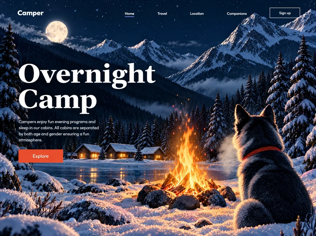
用夜间露营影像、醒目标题与克制交互营造户外氛围,适合营地、房车和旅行服务。
露营过夜全屏首屏
效果案例
READY TO USE
直接开始使用
这条提示词无需补充变量,可查看并复制完整提示词。
复制后粘贴到任意 AI 平台即可直接使用
更新于 2026.10.14 · 持续复测
用夜间露营影像、醒目标题与克制交互营造户外氛围,适合营地、房车和旅行服务。

「紫发金瞳波普风动漫少女」的 AI 图像提示词,适用于 GPT Image。通过效果图查看构图、光线与色彩方向,

「墨绿短发日常系动漫少女」的 AI 图像提示词,适用于 GPT Image。通过效果图查看构图、光线与色彩方向,

「珊瑚粉双马尾学园走廊少女」的 AI 图像提示词,适用于 GPT Image。通过效果图查看构图、光线与色彩方向

「蜜金发琥珀瞳学园少女动漫」的 AI 图像提示词,适用于 GPT Image。通过效果图查看构图、光线与色彩方向

「樱色双丸子头可爱少女动漫」的 AI 图像提示词,适用于 GPT Image。通过效果图查看构图、光线与色彩方向

「橙发麻花辫元气少女动漫」的 AI 图像提示词,适用于 GPT Image。通过效果图查看构图、光线与色彩方向,
查看完整提示词,复制后粘贴到任意 AI 平台使用。
Build one standalone HTML file (no folders, no local assets, no frameworks) that recreates this full-viewport hero website EXACTLY.

OUTPUT
- A single index.html: HTML + CSS + JS only.
- Title: Camper — Overnight Camp
- charset utf-8, viewport width=device-width initial-scale=1 viewport-fit=cover, theme-color #0b1a2b
- html/body height 100%, overflow hidden, background #0b1a2b, antialiased text
- Do not use local images, fonts, or video files. Do not invent a different video URL.

BACKGROUND VIDEO (MANDATORY — exact URL)
Use this CloudFront URL and no other:
https://d8j0ntlcm91z4.cloudfront.net/user_38xzZboKViGWJOttwIXH07lWA1P/hf_20261005_115704_e1b28e05-aef1-477c-924b-0c1d4612f86f.mp4

<video id="bg"> inside #stage:
- autoplay muted loop playsinline disablepictureinpicture preload="auto"
- width="1280" height="960"
- aria-label="Moonlit winter camp: a dog watching a campfire beside cabins below snowy peaks"
- <source src="THE_URL_ABOVE" type="video/mp4">
- CSS: 1280×960, object-fit:cover, object-position:50% 58%, pointer-events:none, display:block
- The video is a 16:9 Kling animation of a moonlit winter camp (husky by a campfire, snowy cabins, pines, peaks, full moon). Cover-crop it into the 1280×960 stage so it fills with no letterboxing.

FONTS (Google Fonts, display=block)
<link rel="preconnect" href="https://fonts.googleapis.com">
<link rel="preconnect" href="https://fonts.gstatic.com" crossorigin>
<link href="https://fonts.googleapis.com/css2?family=Gelasio:wght@700&family=Outfit:wght@400;500;600;700&display=block" rel="stylesheet">

Use:
- Headline: 'Gelasio', Georgia, 'Times New Roman', serif, weight 700
- Everything else: 'Outfit', 'Century Gothic', 'Poppins', system-ui, sans-serif
  - Logo 700, nav 600, Sign up 500, body/Explore 400
Fallbacks only. Do not use Inter, Playfair, or other families.

DESIGN TOKENS (CSS :root, measured on a 1280×960 canvas; all UI scales by --u)
--orange:#ec4f30; --orange-hi:#f15a3c; --underline:#7e80d7;
--ink:#ffffff; --ink-soft:rgba(255,255,255,.92); --rule:rgba(255,255,255,.92); --night:#0b1a2b;
--h1-size:104.64; --h1-ls:1.72; --h1-lh:101; --h1-off:2.1;
--p-size:16.6; --p-lh:24.7; --p-w:322; --p-gap:32;
--btn-gap:30; --btn-w:178; --btn-h:51; --btn-size:17.48;
--nav-size:13.79; --nav-gap:93.9; --nav-shift:3;
--logo-size:23.34; --logo-shift:1;
--su-size:14.34; --su-w:122; --su-h:41; --su-bw:1.5;
--head-top:25; --head-left:65.6; --head-right:69;
--ul-w:37; --ul-h:2; --ul-top:31.5;
--u:1; --hero-top:272px;

Every type/spacing size is calc(TOKEN * 1px * var(--u)). Square corners. No box-shadows. No border-radius except 2px on burger bars.

MARKUP (exact copy, exact IDs/classes)
#app[data-mode="exact"][data-menu="closed"] position:fixed; inset:0; overflow:hidden;
  #stage 1280×960, transform-origin 0 0, transform: translate(var(--tx), var(--ty)) scale(var(--s))
    #bg video as above
  #topscrim  (gradient overlay at top)
  #scrim     (mobile/tablet menu dim)
  header#masthead
    a.logo href="#"  Camper
    .cluster#nav-panel
      nav.links#links aria-label="Main"
        a.is-active href="#" aria-current="page"  Home
        a href="#"  Travel
        a href="#"  Location
        a href="#"  Companions
      a.signup href="#"  Sign up
    button#menu-btn type="button" aria-label="Menu" aria-expanded="false" aria-controls="nav-panel"
      two empty <span> bars
  section#hero
    h1: two stacked lines, each wrapped <span class="ln"><span>WORD</span></span>
      Overnight
      Camp
    p: Campers enjoy fun evening programs and sleep in our cabins. All cabins are separated by both age and gender ensuring a fun atmosphere.
    a.explore href="#"  Explore

HEADER (desktop / exact)
- Absolute: top 25u, left 65.6u, right 69u, flex space-between
- Logo white, size 23.34u, translateY(1u)
- Nav gap 93.9u. Links 13.79u / 600 / ink-soft, translateY(3u)
- Active Home: full white + centered underline #7e80d7, 37×2u, top 31.5u
- Sign up: 122×41u, 14.34u / 500, 1.5u solid white border, no radius. Hover (hover:hover): fill white, text #0b1a2b
- #menu-btn hidden in exact mode

HERO (desktop / exact)
- Absolute left 72u, top var(--hero-top), width 620u
- h1 104.64u / lh 101u / ls 1.72u / white / margin-top -2.1u
- p 16.6u / lh 24.7u / width 322u / margin-top 32u / ink-soft
- Explore: 178×51u, margin-top 30u, bg #ec4f30, white 17.48u / 400, flex center. Hover #f15a3c. Active translateY(1px)
- Focus-visible on links: 2u white outline, 3u offset

TOP SCRIM
linear-gradient(180deg, rgba(8,17,29,.88) 0%, rgba(8,17,29,.52) 42%, rgba(8,17,29,.18) 74%, rgba(8,17,29,0) 100%)
height 178u, opacity var(--scrim,0). Compact: height 132px, opacity .5

THREE LAYOUT MODES via JS on #app data-mode (not CSS media-width alone)

Constants:
DW=1280 DH=960 HERO_H=411 HEAD_H=66 UI_MIN_H=560
U_DESK=0.874 PHONE_W=600 TAB_REF=840 T_MIN=0.873 T_MAX=1.08
Use visualViewport width/height when present.

uw = vw/DW
ut = min(min(max(vw/TAB_REF, T_MIN), T_MAX), vh/UI_MIN_H)
mode = uw >= U_DESK ? 'exact' : (vw >= PHONE_W && ut >= T_MIN) ? 'tablet' : 'compact'

EXACT (wide desktop, ~vw >= 1120)
- Cover-scale art: s = max(vw/DW, vh/DH)
- visW = min(DW, vw/s), visH = min(DH, vh/s)
- k = min(1, visW/DW); u = min(s*k, vh/UI_MIN_H)
- tx = clamp so stage stays covering: tx = vw/2 - DW*0.5*s, then min(0, max(vw-DW*s, tx)); ty = (vh-DH*s)/2
- Set --s --tx --ty --u
- --scrim = (min(1,max(0,(DH-visH)/240))*0.45)
- --hero-top = max(0,(vh-HERO_H*u))*0.495449
- Full horizontal nav visible. Artwork never letterboxes.

TABLET (between ~600px and exact)
- Same composition, u = ut, crop bias 0.22*(1-visW/DW) so fire + dog stay in frame
- tx = vw/2 - DW*(0.5+bias)*s, then clamp
- --hero-top clamped between HEAD_H*u+28u and vh-HERO_H*u-28u
- Nav collapses to burger + right drawer
- fitHero(): if hero taller than remaining space, scale(max(0.55, avail/h)) from left top; keep hero below header

COMPACT / MOBILE (vw < 600 or tablet unit too small)
- CSS grid: header row auto, rest 1fr. --u=1. Stage transform none, width/height 100%
- #bg object-fit cover, object-position 72% 50% (dog’s head in frame, headline on dark sky)
- --mpad: clamp(22px,5.6vw,34px)
- --mgap: clamp(18px, min(6vw,3.2vh), 34px)
- Header relative, margin top clamp(14px,min(4.4vw,2.6vh),28px)+safe-area
- Logo clamp(23px,min(4.4vw,5.4vh),34px)
- Hero relative, align-self start, margins clamp(20px,min(7.4vh,8vw),72px) / mpad / bottom clamp(18px,3vh,30px)+safe-area
- h1 clamp(40px,min(14.2vw,15vh),112px), lh .96, letter-spacing 0, margin-left -.02em
- p clamp(14px,min(3.9vw,2.3vh),19px), lh 1.47, width min(100%,38ch)
- Explore clamp(150px,44vw,196px) × clamp(46px,min(12vw,11vh),58px), font clamp(15px,min(4vw,3.4vh),18px)
- Top scrim height clamp(240px,52vh,520px), opacity .55
- Landscape phones max-height 520px: --mgap clamp(14px,2.6vh,24px); hero max-width min(60vw,460px); h1 clamp(38px,min(11vw,13.5vh),72px); p min(100%,36ch) so fire/dog stay visible beside type

COLLAPSED NAV (tablet + compact, i.e. #app:not([data-mode=exact]))
- Burger: two white bars 28u and 20u wide, 1.6u thick, gap 5u, 34u hit box; extra 44px invisible hit area via ::before
- Open: bars rotate into an X (translateY ±3.3u, rotate ±45deg, width 24u)
- Drawer: fixed right, width min(64vw,360px), column, bg rgba(9,20,34,.93), blur(16px) saturate(140%), left border rgba(255,255,255,.14), slide from translateX(102%), 0.34s cubic-bezier(.4,0,.2,1)
- Links column, clamp(19px,2.3vw,23px); active underline left-aligned 36×2 under the word
- Sign up clamp(126px,17vw,158px) × clamp(44px,5.2vh,52px)
- #scrim rgba(5,12,22,.5) fades in; click scrim / Escape / a nav link closes menu
- data-menu="open"|"closed"; aria-expanded on button

ENTRANCE ANIMATION (Web Animations API, once, then static)
Artwork never moves. Interface arrives onto a still scene. Set initial states synchronously before first paint (no flash). If JS fails, page looks finished.

Easings: EXPO cubic-bezier(.16,1,.3,1)   SOFT cubic-bezier(.22,.75,.2,1)

Start after fonts.ready AND video loadeddata (or error), raced against 1000ms timeout, then rAF.

If prefers-reduced-motion: header+hero opacity 0→1 in 240ms linear only. Also * { transition-duration:.01ms !important }

Else:
A. Headline — each .ln is a fixed clip window inset(-40% -8% -8% -8%); inner span starts translateY(112%) → none. Duration 900, delay 380 + i*120, EXPO
B. Soft rise — exact: [logo, Home, Travel, Location, Companions, Sign up]; other modes: [logo, menu-btn]. opacity 0 + translateY(9px) → none. Duration 540, delay 90+i*55, SOFT
   Paragraph: opacity 0 + translateY(12px) → none. Duration 680, delay 860, SOFT
C. Explore edge wipe — clip-path inset(0 100% 0 0) → inset(0 0 0 0). Duration 600, delay 1060, EXPO

Safety: clear all inline opacity/transform/clipPath after animations finish or at 3500ms.

RESIZE
rAF-throttled layout on window resize, orientationchange, visualViewport resize. Re-run layout after document.fonts.ready.

DO NOT
- Add extra sections, footer, forms, or pages
- Download/host the video locally or swap the URL
- Use CSS @media (max-width) as the only breakpoint system — JS data-mode is required
- Animate or parallax the background video
- Rounded Explore/Sign up buttons
- Lorem ipsum or different copy

The result must be a faithful 1:1 recreation of this Camper overnight-camp full-screen hero: moonlit looping video background, white Outfit UI, Gelasio “Overnight / Camp” stacked serif headline, orange Explore CTA, measured 1280×960 composition scaling, tablet drawer, and compact mobile reflow.
提示词已复制,选择一个常用平台继续。
