

面向现代品牌的网页首屏效果,以3D 空间、悬停反馈、沉浸式视频组织视觉层次;适合用于网页原型、品牌展示与交互动效参考。
传承林地品牌页
效果案例
READY TO USE
直接开始使用
这条提示词无需补充变量,可查看并复制完整提示词。
复制后粘贴到任意 AI 平台即可直接使用
更新于 2026.10.14 · 持续复测
面向现代品牌的网页首屏效果,以3D 空间、悬停反馈、沉浸式视频组织视觉层次;适合用于网页原型、品牌展示与交互动效参考。

「紫发金瞳波普风动漫少女」的 AI 图像提示词,适用于 GPT Image。通过效果图查看构图、光线与色彩方向,

「墨绿短发日常系动漫少女」的 AI 图像提示词,适用于 GPT Image。通过效果图查看构图、光线与色彩方向,

「珊瑚粉双马尾学园走廊少女」的 AI 图像提示词,适用于 GPT Image。通过效果图查看构图、光线与色彩方向

「蜜金发琥珀瞳学园少女动漫」的 AI 图像提示词,适用于 GPT Image。通过效果图查看构图、光线与色彩方向

「樱色双丸子头可爱少女动漫」的 AI 图像提示词,适用于 GPT Image。通过效果图查看构图、光线与色彩方向

「橙发麻花辫元气少女动漫」的 AI 图像提示词,适用于 GPT Image。通过效果图查看构图、光线与色彩方向,
查看完整提示词,复制后粘贴到任意 AI 平台使用。
Create exactly ONE file, named `index.html`, in the project root.
Do not create any other file: no footer.html, no styles.css, no script.js, no assets
folder, no README, no config. Everything — markup, CSS, SVG icons — lives inside
`index.html`. If `index.html` already exists, overwrite it.
Build a single, self-contained, full-viewport website footer section. No build step,
no frameworks, no external JS. Only external resource allowed: Google Fonts.
Set the document title to "Heritage Grove — Footer".
=== BACKGROUND VIDEO (use these exact URLs verbatim, do not download or substitute) ===
Video (MP4):
https://d8j0ntlcm91z4.cloudfront.net/user_38xzZboKViGWJOttwIXH07lWA1P/hf_20260901_122529_931c22c8-8d2d-47c0-ad51-b97f56a91e42.mp4
Poster / reduced-motion still (PNG):
https://d2ol7oe51mr4n9.cloudfront.net/user_38xzZboKViGWJOttwIXH07lWA1P/4f690bd1-881a-4192-82f2-d714d34c8fb9.png
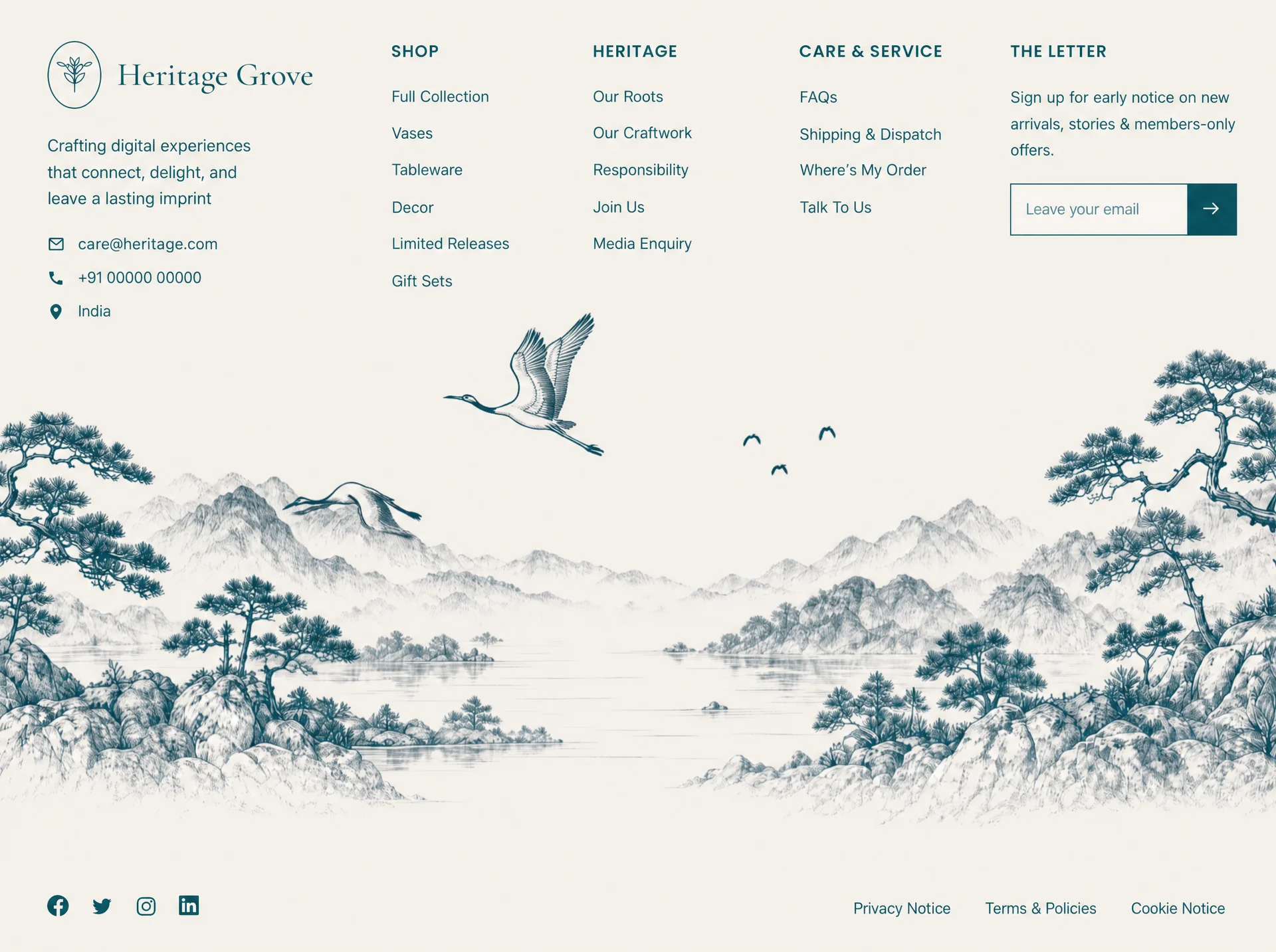
The clip is a 10s, 1080p, 16:9 loop of a hand-drawn teal ink landscape — misty layered
mountains, a still lake, pine-covered rocky outcrops on both edges, two cranes gliding
across a cream paper sky. Static camera. It is the section's only imagery.
=== FONTS ===
<link rel="preconnect" href="https://fonts.googleapis.com">
<link rel="preconnect" href="https://fonts.gstatic.com" crossorigin>
https://fonts.googleapis.com/css2?family=Cormorant+Garamond:wght@400;500;600&family=Poppins:wght@300;400;500;600&display=swap
- Body/UI: Poppins, fallback "Helvetica Neue", Arial, sans-serif
- Brand wordmark only: Cormorant Garamond 500, fallback Georgia, serif
=== COLOR TOKENS (:root) ===
--ink: #175A67 (all text, icons, borders, button fill)
--ink-soft: #2A707C (input placeholder, at .85 opacity)
--cream: #EAE3DE (page + section background; set on html AND body AND .site-footer)
--max: 1440px
--fs-nav: clamp(.9rem, .55vw + .75rem, 1.02rem)
Button hover fill: #0F454F
=== DOM STRUCTURE ===
<footer class="site-footer">
<div class="footer-media" aria-hidden="true">
<video class="footer-bg" autoplay muted loop playsinline preload="auto" poster="[POSTER URL]">
<source src="[VIDEO URL]" type="video/mp4">
</video>
</div>
<div class="footer-inner">
<div class="footer-grid">
<div class="brand">…</div>
<nav class="col" aria-label="Shop">…</nav>
<nav class="col" aria-label="Heritage">…</nav>
<nav class="col" aria-label="Care and service">…</nav>
<div class="newsletter">…</div>
</div>
<div class="footer-bottom">
<div class="socials">…</div>
<nav class="legal" aria-label="Legal">…</nav>
</div>
</div>
</footer>
=== EXACT COPY ===
Brand wordmark: Heritage Grove
Blurb: Crafting digital experiences that connect, delight, and leave a lasting imprint
Contacts (icon + text rows, in order):
envelope icon → care@heritage.com (mailto:care@heritage.com)
phone icon → +91 00000 00000 (tel:+910000000000)
map-pin icon → India (plain <span>, not a link)
Column 1 heading "Shop": Full Collection / Vases / Tableware / Decor / Limited Releases / Gift Sets
Column 2 heading "Heritage": Our Roots / Our Craftwork / Responsibility / Join Us / Media Enquiry
Column 3 heading "Care & Service": FAQs / Shipping & Dispatch / Where's My Order / Talk To Us
(use ’ for the apostrophe in Where's)
Column 4 heading "The Letter":
paragraph: Sign up for early notice on new arrivals, stories & members-only offers.
form with visually-hidden <label for="nl-email">Email address</label>,
<input id="nl-email" type="email" name="email" placeholder="Leave your email"
autocomplete="email" required>, and a submit button aria-label="Subscribe"
containing a right-arrow SVG.
Bottom bar left: Facebook, Twitter, Instagram, LinkedIn links (aria-labels, href="#")
Bottom bar right: Privacy Notice / Terms & Policies / Cookie Notice
All headings are written in title case in the HTML and uppercased via CSS text-transform.
=== ICONS — inline SVG only, no icon fonts, no images ===
Contact + social + arrow icons: 24x24 viewBox, fill="currentColor" (arrow is
fill="none" stroke="currentColor" stroke-width="1.8", round caps/joins, path "M4 12h15M13 6l6 6-6 6").
Brand mark: class="brand-mark", viewBox="0 0 96 120", fill="none",
stroke="currentColor", stroke-width="2" — an upright oval frame containing a small
sprig/seedling. Exact paths:
<ellipse cx="48" cy="60" rx="45" ry="57"/>
<path d="M48 88V46" stroke-linecap="round"/>
<path d="M48 58c-8-2-14-8-16-16 9 0 15 5 16 16Zm0 0c8-2 14-8 16-16-9 0-15 5-16 16Z"/>
<path d="M48 74c-9-2-15-8-17-17 10 0 16 6 17 17Zm0 0c9-2 15-8 17-17-10 0-16 6-17 17Z"/>
<path d="M48 46c-6-3-9-9-8-16 6 3 9 9 8 16Zm0 0c6-3 9-9 8-16-6 3-9 9-8 16Z"/>
<path d="M30 44c-5 1-9-1-12-5 5-2 9-1 12 5Zm36 0c5 1 9-1 12-5-5-2-9-1-12 5Z"/>
=== DESKTOP LAYOUT (>1100px) ===
.site-footer: position:relative; isolation:isolate; display:flex; flex-direction:column;
min-height:100vh then min-height:100svh; overflow:hidden; overflow-wrap:break-word;
background #EAE3DE; padding:
clamp(2.25rem,4.5vh,4rem)
max(clamp(1.25rem,4vw,4.5rem), env(safe-area-inset-right))
max(clamp(1.5rem,3vh,2.75rem), env(safe-area-inset-bottom))
max(clamp(1.25rem,4vw,4.5rem), env(safe-area-inset-left));
.footer-media: position:absolute; inset:0; z-index:-2; pointer-events:none;
.footer-bg (video): position:absolute; inset:0; width:100%; height:100%;
object-fit:cover; object-position:center bottom; pointer-events:none.
FULL-BLEED — there is NO scrim, veil, tint, blur or gradient over the video on desktop.
Text sits directly on the artwork.
.footer-inner: position:relative; width:100%; max-width:1440px; margin:0 auto; flex:1;
display:flex; flex-direction:column.
.footer-grid: display:grid; align-items:start; gap:clamp(1.5rem,3vw,3.25rem);
grid-template-columns: minmax(240px,1.45fr) repeat(3,minmax(130px,.85fr)) minmax(260px,1.25fr);
.brand-lockup: flex, align-items:center, gap:clamp(.65rem,1vw,1rem)
.brand-mark: width:clamp(52px,4.4vw,74px); height:auto
.brand-name: Cormorant Garamond 500; font-size:clamp(1.85rem,2.5vw,2.9rem); line-height:1; margin:0
.brand-blurb: margin-top clamp(1.15rem,2.4vh,1.9rem); max-width:24ch; line-height:1.62
.contact-list: list-style none; margin-top clamp(1.15rem,2.4vh,1.9rem);
column flex, gap clamp(.6rem,1.2vh,.95rem); each li flex/center with .85rem gap;
icons 19x19; links no underline, underline on hover with text-underline-offset:3px
.col-title: margin 0 0 clamp(1.15rem,2.4vh,1.85rem); font-size clamp(.95rem,.5vw + .8rem,1.12rem);
font-weight 600; letter-spacing .055em; text-transform uppercase
.link-list: column flex, gap clamp(.62rem,1.35vh,1.05rem); links inline-block, no underline,
transition opacity .2s ease, transform .2s ease; hover → opacity .62 and translateX(2px)
.newsletter p: margin 0 0 clamp(1rem,2.2vh,1.6rem); max-width 32ch; line-height 1.62
.subscribe: flex row; width 100%; max-width 380px; border 1px solid var(--ink);
background rgba(255,255,255,.4)
.subscribe input: flex:1; min-width:0; border 0; outline 0; background transparent;
padding .95rem 1.05rem; font-family inherit; font-size var(--fs-nav);
placeholder color var(--ink-soft) at .85 opacity;
:focus-visible → box-shadow inset 0 0 0 2px rgba(23,90,103,.25)
.subscribe button: width clamp(56px,4vw,66px); no border; background var(--ink);
color var(--cream); display:grid; place-items:center; transition background .2s ease;
hover #0F454F; svg 22x22
.footer-bottom: margin-top:auto; padding-top clamp(2.5rem,6vh,4.5rem);
flex row, align-items center, justify-content space-between, gap 1.25rem 2rem, flex-wrap wrap
.socials: flex row, gap clamp(.9rem,1.5vw,1.5rem); svg 26x26;
hover → opacity .65 and translateY(-2px)
.legal: flex row, gap clamp(1.15rem,2.6vw,3rem), flex-wrap wrap; links underline on hover
.sr-only: absolute 1px/1px clip-rect visually-hidden helper
Also: *,*::before,*::after{box-sizing:border-box} and html{-webkit-text-size-adjust:100%}
=== RESPONSIVE — 5 breakpoints, in this order ===
@media (max-width:1100px)
.footer-grid → 1fr 1fr 1fr; row-gap clamp(2rem,4vh,2.75rem)
.brand and .newsletter → grid-column: 1 / -1
.brand-blurb → max-width 42ch
@media (max-width:720px) ← phones
KEY CHANGE: the video stops being an absolute background and becomes a real
flex item AFTER the copy, so nothing overlaps and nothing is zoom-cropped.
.site-footer → height:auto; min-height:100svh; padding-right/bottom/left:0;
overflow-x:hidden; overflow-y:visible
.footer-inner → order:0; padding-right/left max(clamp(1.25rem,4vw,4.5rem), env(safe-area-inset-*));
padding-bottom clamp(1.25rem,3vh,2rem)
.footer-media → position:relative; inset:auto; order:1; flex-shrink:0; width:100%;
height:auto; margin-top:auto; z-index:0
.footer-bg → position:relative; inset:auto; width:100%; height:auto; max-width:100%;
object-fit:contain; object-position:center bottom; transform:none; display:block
.footer-grid → 1fr 1fr; gap clamp(1.75rem,5vw,2.25rem)
.brand-blurb → max-width 34ch
.footer-bottom → column, align-items flex-start, gap 1.5rem,
padding-top clamp(2rem,7vh,3rem), padding-bottom clamp(1.25rem,3vh,2rem)
.legal → gap 1.1rem 1.5rem
Touch ergonomics (trade list gap for tap padding, ~40px targets):
.link-list{gap:.2rem} .link-list a{padding:.55rem 0}
.contact-list{gap:.25rem} .contact-list a,.contact-list span{padding:.4rem 0}
.legal a{padding:.45rem 0}
.socials a{padding:.3rem;margin:-.3rem} .socials svg{width:28px;height:28px}
.subscribe input{font-size:16px;padding:1rem 1.05rem} ← 16px stops iOS focus-zoom
@media (max-width:440px)
:root{--fs-nav:.92rem}; .footer-grid{gap:1.35rem 1.25rem};
.col-title{margin-bottom:.85rem}; .brand-blurb,.newsletter p{max-width:none};
.subscribe{max-width:none}
@media (max-width:359px)
.footer-grid → single column
@media (min-width:721px) and (max-width:1100px) ← tablets
Apply the identical bottom-of-page video treatment as the phone block above
(.site-footer, .footer-inner, .footer-media, .footer-bg rules repeated verbatim),
while keeping the 3-column grid and desktop touch/spacing rules.
@media (max-width:1100px) ← soft seam, mobile + tablet only, never on desktop
.footer-media::after — content:""; position:absolute; left/right/top:0;
height:clamp(52px,16vw,120px); pointer-events:none; z-index:1;
background:linear-gradient(to bottom,#EAE3DE 0%,rgba(234,227,222,.65) 38%,rgba(234,227,222,0) 100%)
(this only blends the top edge of the clip into the page; it is NOT a scrim over the art)
Requirement: zero horizontal overflow at every width from 320px to 1440px.
=== ENTRANCE ANIMATIONS (CSS only, opacity + transform, no layout shift) ===
@keyframes rise-in { from{opacity:0;transform:translate3d(0,14px,0)} to{opacity:1;transform:translate3d(0,0,0)} }
@keyframes fade-in { from{opacity:0} to{opacity:1} }
.footer-bg → animation: fade-in 1.35s ease both
These all get `animation: rise-in .72s cubic-bezier(.22,1,.36,1) both`:
.brand-lockup, .brand-blurb, .contact-list li, .col .col-title, .col .link-list li,
.newsletter .col-title, .newsletter p, .subscribe, .socials a, .legal a
Delays (exact):
.brand-lockup .04s | .brand-blurb .12s
.contact-list li 1/2/3 → .2s / .28s / .36s
Per-column stagger token: .footer-grid > .col:nth-child(2){--col-stagger:.16s}
nth-child(3){--col-stagger:.24s} nth-child(4){--col-stagger:.32s}
.col .col-title → var(--col-stagger,.2s)
.col .link-list li:nth-child(1..6) → calc(var(--col-stagger,.2s) + .08s … + .48s) in .08s steps
.newsletter .col-title .4s | .newsletter p .48s | .subscribe .56s
.socials a 1–4 → .64s / .7s / .76s / .82s
.legal a 1–3 → .7s / .78s / .86s
=== REDUCED MOTION ===
@media (prefers-reduced-motion:reduce)
.footer-bg → display:none; animation:none
.site-footer → background-color #EAE3DE + background-image url([POSTER URL]);
background-position center bottom; background-size cover; background-repeat no-repeat
nested @media (max-width:1100px) inside it → .site-footer{background-size:100% auto}
.footer-media::after → content:none
All rise-in elements → animation:none; .link-list a:hover,.socials a:hover → transform:none
=== DESIGN INTENT — do not "improve" these ===
1. NO overlay of any kind on the video on desktop: no gradient veil, no tint, no blur,
no darkening. The copy sits directly on the artwork. This was deliberate.
2. Desktop is full-bleed cover. Portrait viewports (≤1100px) must NOT use cover — the
16:9 clip would zoom ~2.5x and drag the cranes up through the link columns. It becomes
a flow item under the copy at its own aspect ratio instead.
3. Everything is one file. No JS. The video is the only motion besides CSS keyframes.
=== DELIVERABLE ===
A single file at `index.html`. Nothing else. Do not split the CSS out, do not emit a
second HTML file, do not rename it.
提示词已复制,选择一个常用平台继续。
