
面向现代品牌的网页首屏效果,以悬停反馈、沉浸式视频组织视觉层次;适合用于网页原型、品牌展示与交互动效参考。
天际私人飞机
效果案例
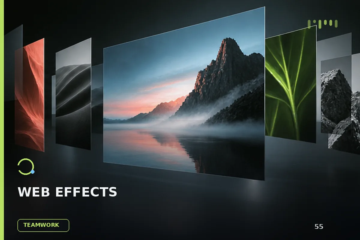
READY TO USE
直接开始使用
这条提示词无需补充变量,可查看并复制完整提示词。
复制后粘贴到任意 AI 平台即可直接使用
更新于 2026.10.14 · 持续复测
面向现代品牌的网页首屏效果,以悬停反馈、沉浸式视频组织视觉层次;适合用于网页原型、品牌展示与交互动效参考。

「紫发金瞳波普风动漫少女」的 AI 图像提示词,适用于 GPT Image。通过效果图查看构图、光线与色彩方向,
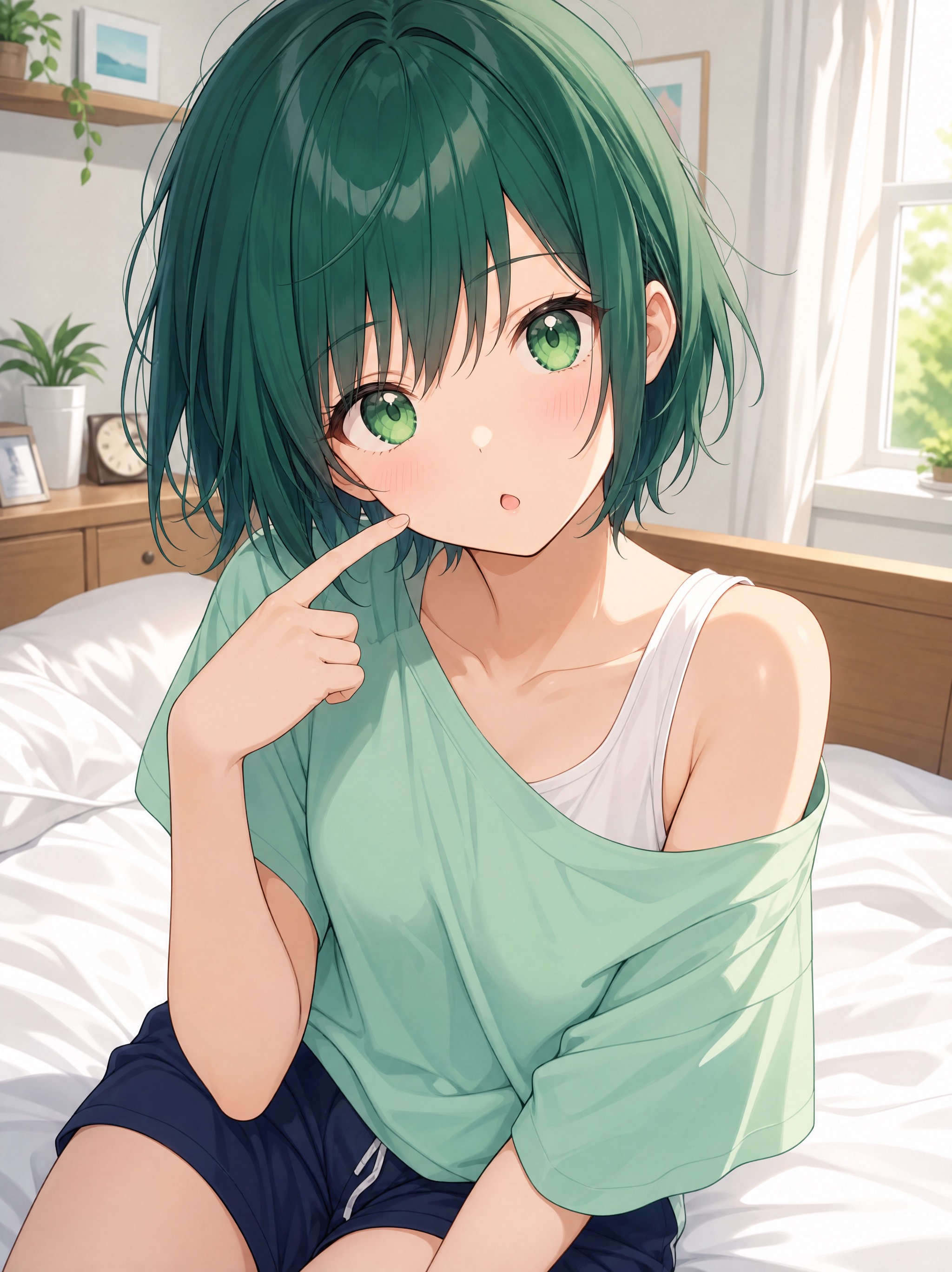
「墨绿短发日常系动漫少女」的 AI 图像提示词,适用于 GPT Image。通过效果图查看构图、光线与色彩方向,
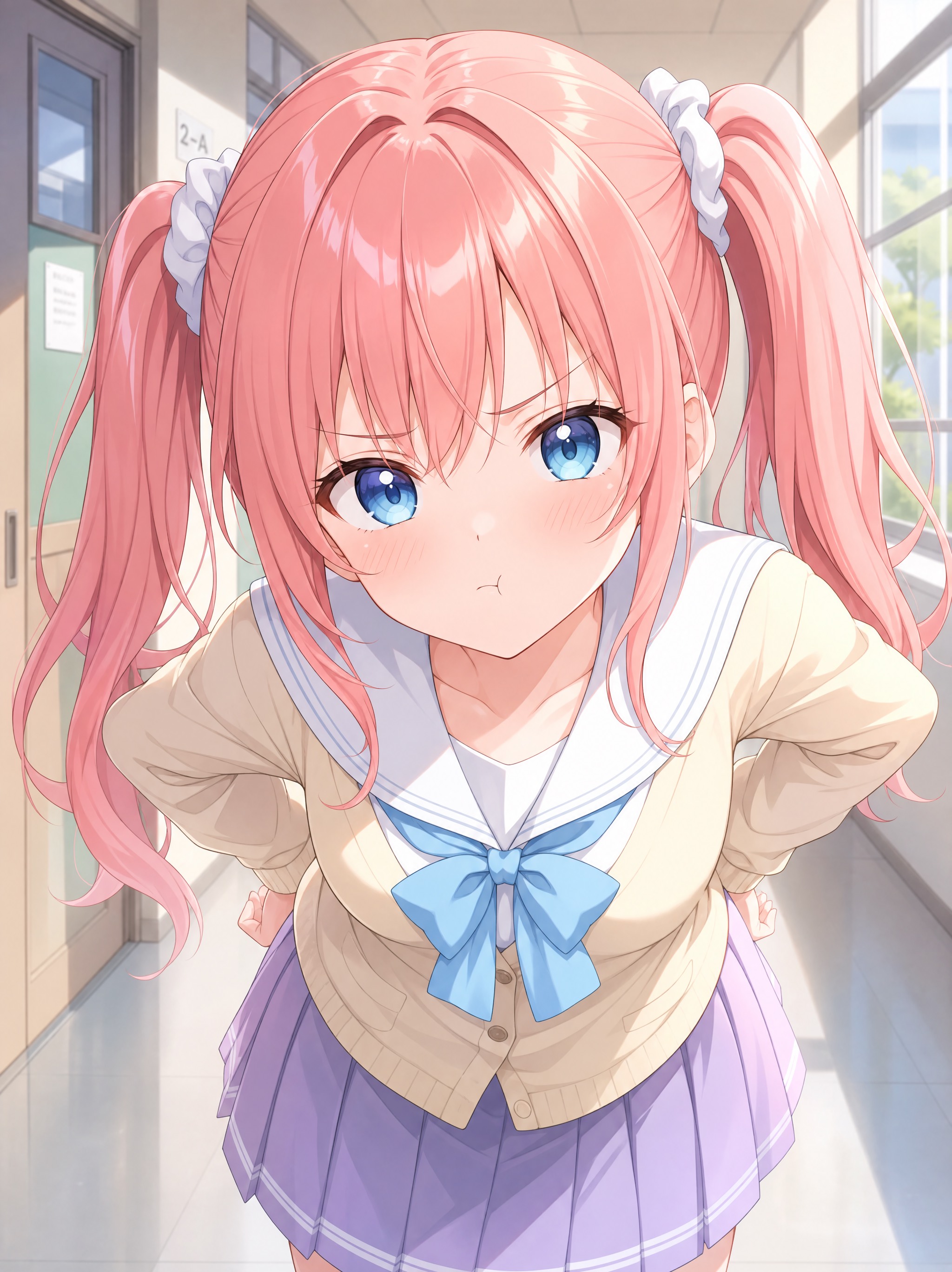
「珊瑚粉双马尾学园走廊少女」的 AI 图像提示词,适用于 GPT Image。通过效果图查看构图、光线与色彩方向
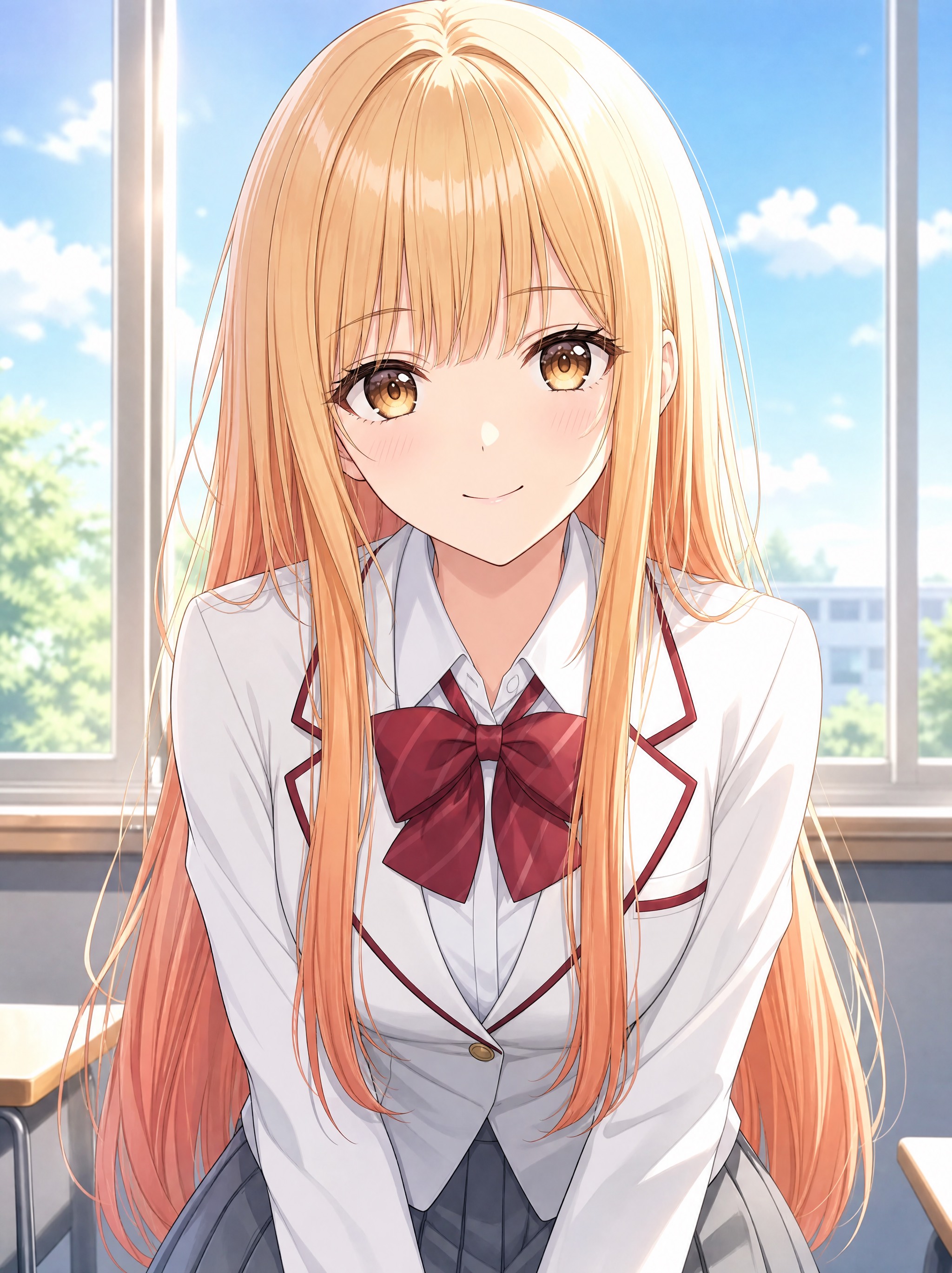
「蜜金发琥珀瞳学园少女动漫」的 AI 图像提示词,适用于 GPT Image。通过效果图查看构图、光线与色彩方向
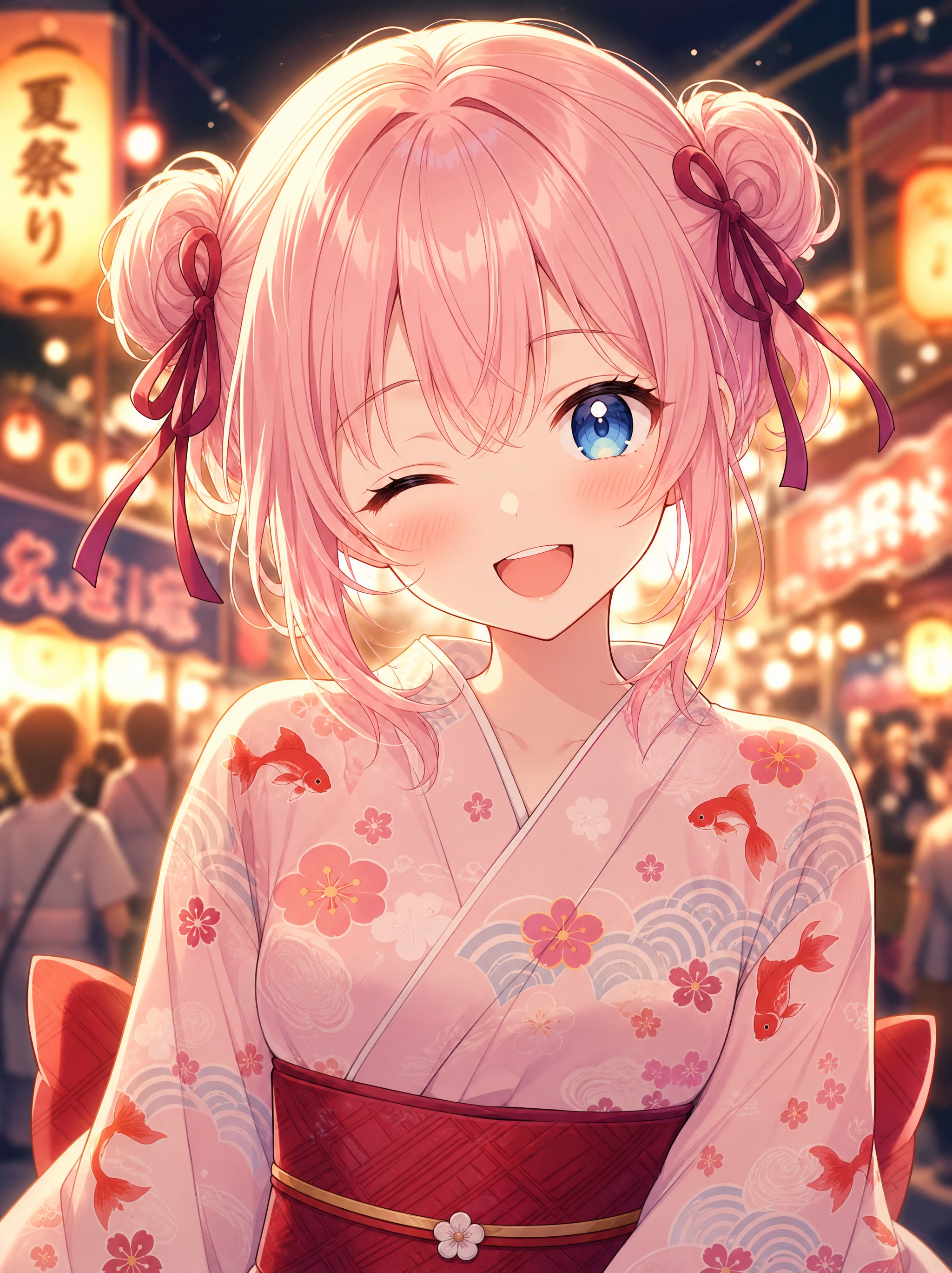
「樱色双丸子头可爱少女动漫」的 AI 图像提示词,适用于 GPT Image。通过效果图查看构图、光线与色彩方向
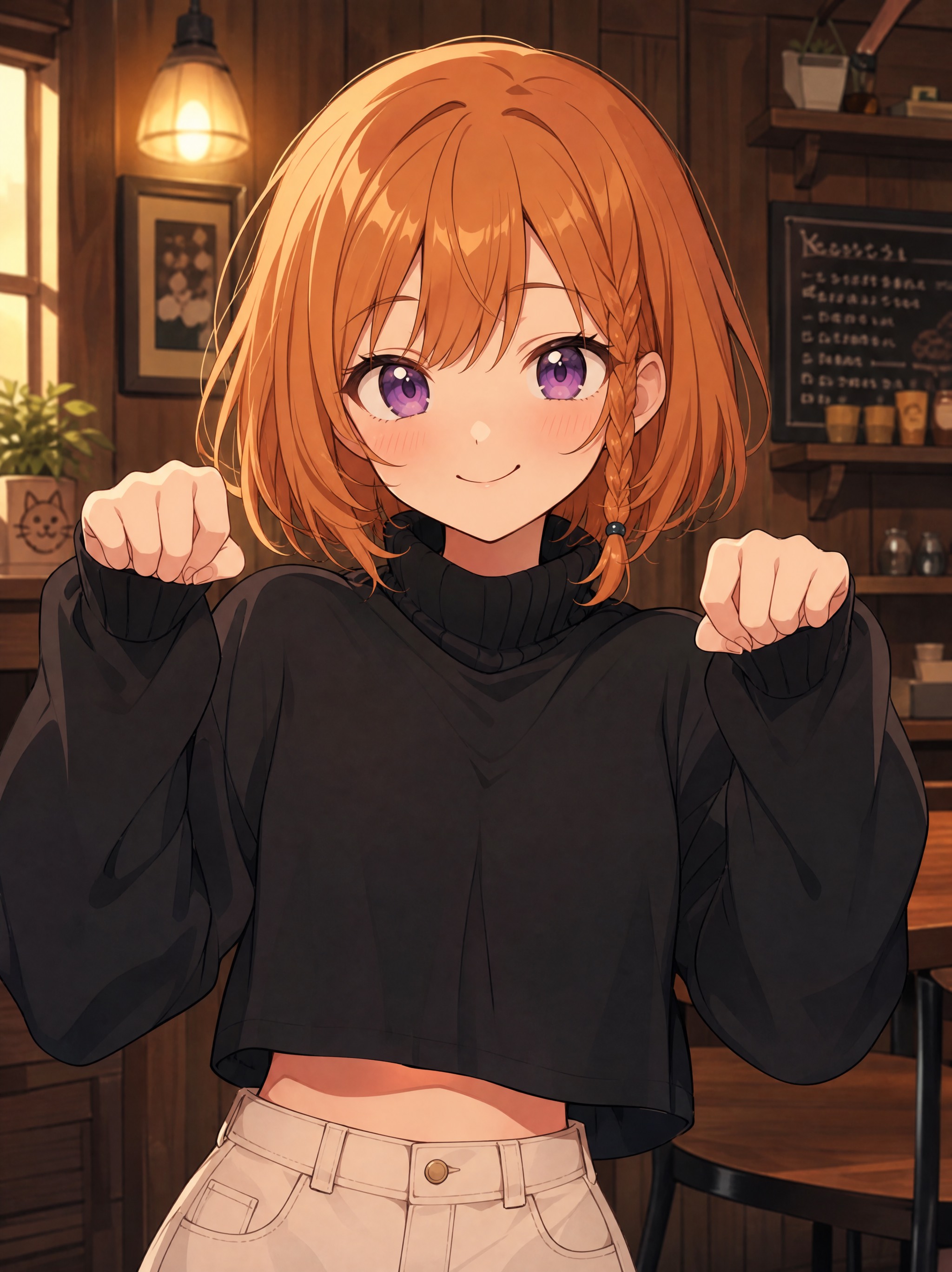
「橙发麻花辫元气少女动漫」的 AI 图像提示词,适用于 GPT Image。通过效果图查看构图、光线与色彩方向,
查看完整提示词,复制后粘贴到任意 AI 平台使用。
Create a premium private jet landing page hero section with the following specifications:

Video Background:
Use this exact CloudFront video URL: https://d8j0ntlcm91z4.cloudfront.net/user_38xzZboKViGWJOttwIXH07lWA1P/hf_20260328_091828_e240eb17-6edc-4129-ad9d-98678e3fd238.mp4
Video should autoplay, be muted, loop continuously, and include playsInline attribute
Video covers entire viewport (100vh) using object-cover

Navigation Bar:
Brand name "SkyElite" on the left (text-2xl, font-semibold, text-gray-900)
Desktop menu items (hidden on mobile, visible md:flex): Start, Story, Rates, Benefits, FAQ
Navigation links in gray-900 with hover:text-gray-700 transition
Mobile hamburger menu button using Lucide React icons (Menu/X)
Mobile menu appears as dropdown with white/95 opacity background, backdrop blur, rounded corners, shadow
Max width 7xl, centered with px-8 py-6

Hero Content (centered, -mt-80 to pull up):
Small uppercase label: "PRIVATE JETS" (text-sm, font-semibold, gray-600, tracking-wider, mb-4)
Large two-line heading with overlapping effect:
Line 1: "Premium." (text-6xl md:text-7xl lg:text-8xl, font-normal, text-gray-500, leading-none, tracking-tighter)
Line 2: "Accessible." (same size, color: #202A36, negative margin-top: -12px for overlap)
Subtitle: "Your dedication deserves recognition." (text-lg md:text-xl, gray-600, mb-6, max-w-2xl)
Two call-to-action buttons (gap-4, centered):
"Discover" button: px-4 py-2, rounded-full, bg-gray-300, text-gray-800, font-medium, hover:bg-gray-400
"Book Now" button: px-4 py-2, rounded-full, white text, bg-color #202A36, hover color #1a2229 with smooth transitions

Typography:
Use Inter font (import from Google Fonts: 400, 500, 600, 700 weights)
Apply to entire body via CSS

Technical Setup:
React with TypeScript
Tailwind CSS for styling
Lucide React for icons
useState hook for mobile menu toggle
Full screen height container (h-screen)
Responsive breakpoints: mobile-first, md, lg
All transitions use transition-colors class

Layout Structure:
Outer container: min-h-screen, bg-gray-50
Hero section: relative, h-screen, overflow-hidden
Content wrapper: relative, h-full, flex flex-col
Main content area: flex-1, flex items-center justify-center

Make it clean, modern, and premium-looking with smooth interactions.
提示词已复制,选择一个常用平台继续。
